Map Chart in Excel: Explained
In this article, you will learn how to quickly create a Map chart in Excel
What does the Map chart in Excel do?
A Map chart in Excel is a visual representation of geographical data on a map. It allows you to plot and analyze data based on geographical locations, such as countries, regions, or states. The Map chart feature in Excel helps you understand data patterns, trends, and variations across different geographic areas.
With a Map chart, you can assign data values to specific regions on a map. The Map chart then uses colors, shading, or patterns to represent the values associated with each region. This visual representation makes it easier to compare and interpret data across different locations.
What are some uses of a MAP chart in Excel?
Map charts in Excel are useful for a variety of purposes, such as:
- Analyzing sales or revenue data by region.
- Visualizing population or demographic data.
- Examining distribution patterns of products or services.
- Monitoring performance metrics across different locations.
- Presenting survey results or customer data geographically.
Using Map charts in Excel allows you to gain insights into your data in a visually appealing and intuitive way, making it easier to communicate findings and identify trends related to geographic information.
How to use the Map Chart in Excel?
To use the Map Chart feature in Excel, you can follow these steps:
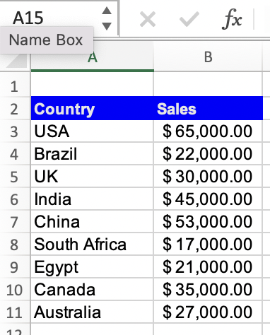
Step 1: Select the data range that you want to include in the map chart, including both the location names and the associated values or categories. Make sure to include column headers for clarity.
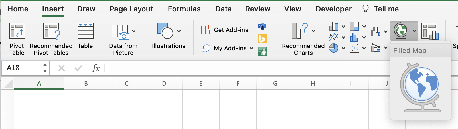
Step 2: In Excel, go to the "Insert" tab on the Ribbon and click on the "Map" button. The Map Chart option may be located within the "Charts" group or in the "Add-Ins" group, depending on your Excel version.
Step 3: After inserting the Map Chart, you can customize it further to enhance its appearance and better represent your data. You can modify chart elements, such as titles, legends, and data labels, and apply formatting options to colors, borders, and markers.
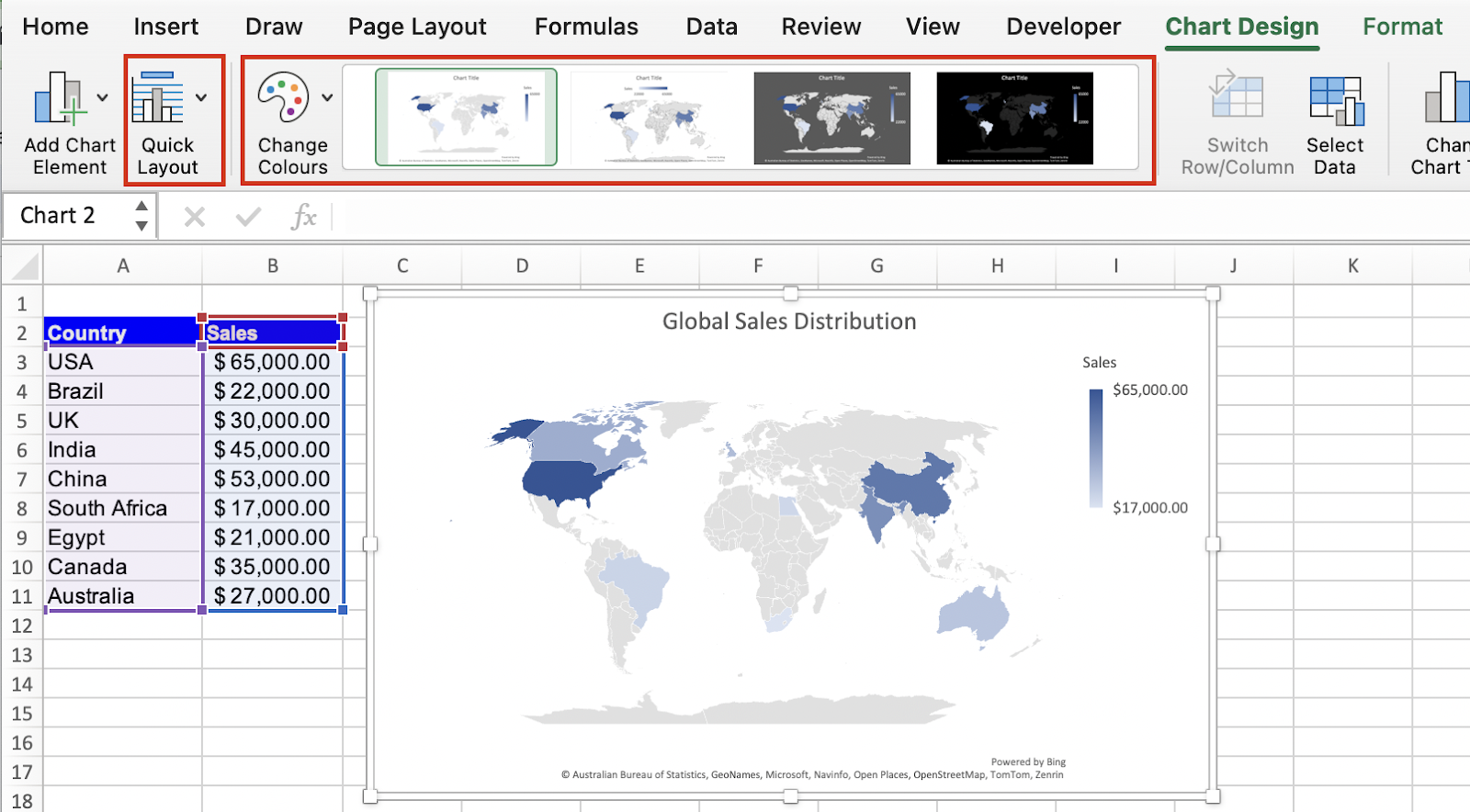
By following these steps, you can utilize the Map Chart feature in Excel to represent geographical data visually and gain insights from the spatial distribution of your information.

