How to Create a Waterfall Chart in Excel
In this article, you will learn about the Waterfall chart and how to create it in Excel.
What is a Waterfall chart in Excel?
A waterfall chart visually represents how an initial value is increased or decreased by a series of intermediate values, resulting in a final value. The chart is named for its resemblance to a series of falling and rising bars that create a "waterfall" effect. Waterfall charts are commonly used in business and finance to show revenue, expenses, or profit changes over time. Each bar in the graph represents a change in value, and the cumulative effect of each change is shown through the length and position of the bars.
How to make a Waterfall chart in Excel
In this article, we will guide you through the steps to create a waterfall chart in Excel.
Step 1: Organize your data
Before creating our waterfall chart, we need to ensure our data is organized properly. This means that our data should be in a table format, with the data values arranged to reflect the changes from the initial start value to the end value. The first column (or row) should contain the category labels, and the second column (or row) should have the starting values and positive or negative changes for each category. Once the data is structured in this way, we can create a waterfall chart by selecting the data and using the chart wizard to create the chart.
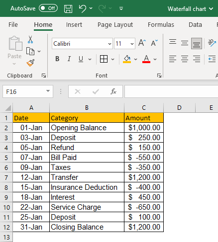
The example dataset taken is for banking transactions that happened in January. The transaction data lists the date-wise transaction category and corresponding amount, whether debited or credited to the account. In terms of data preparation, you need to ensure a clean, formatted, and consistent dataset.
Step 2: Select your data
Once we prepare the data source well, we can select the data we want to include in our waterfall chart. To do this, simply click and drag your mouse over the cells containing the data. If you have a large dataset, you can hold down the "Ctrl" key and select multiple data ranges.

The selected dataset will be highlighted by a border across the text for visual confirmation.
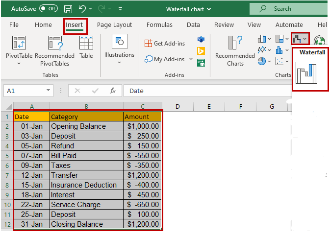
Step 3: Insert the Waterfall chart
We can now insert a line chart into our spreadsheet with our data selected. To do this, navigate to the "Insert" tab on the Excel ribbon and select "Waterfall Chart" from the chart options. Each data point is shown in comparison to the one immediately preceding it, with negative values in a different color from positive values.
Step 4: Add a chart title and legends
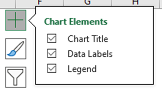
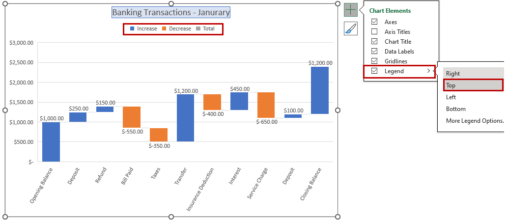
You can add a “title” and a “legend” to make your bar chart more informative. The title should clearly state what the chart represents, while the legend should provide information about the categories defined by the different segments of the graph. To add a title and legend, click on the chart to select it, then use the “Add Chart Element” followed by the “Chart Title” option in the "Chart Design" tab to add them. You can choose the Title layout from the sub-menu.

Another way to quickly access “Chart Elements” is to click on the + icon when you select the chart.
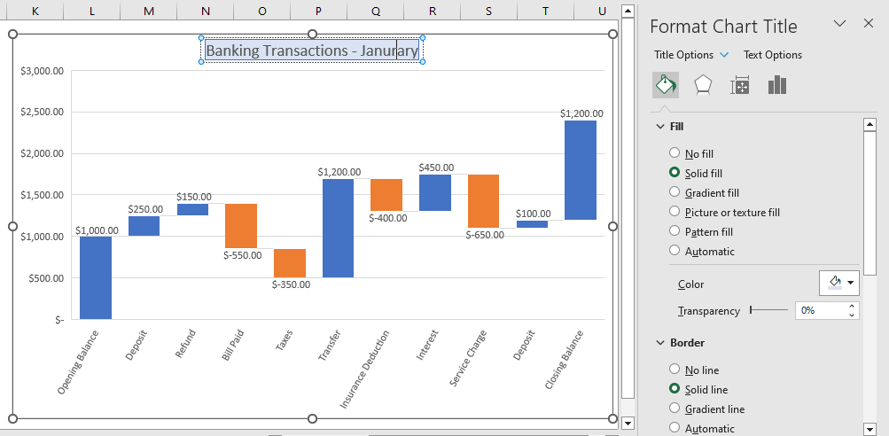
You can rename the Chart Title by clicking on the Title and editing the text directly. The “Format Chart Title” menu appears on the right side of Excel, where you can change the Chart Title's background color and set the Transparency options.
Suppose you click on the Legends, and the “Format Legend” menu appears, which lets you define the position of legend appearance over the chart. You can also modify the text font, colors, and background color.
Step 5: Customize your Waterfall chart
Once you have inserted your line chart, you can customize it to fit your needs. You can change the chart title, axis labels, and legend to provide context for your data. You can also adjust the color scheme and chart style to make your chart visually appealing.
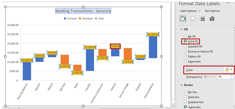
To customize the chart, click on it to select it, then use the options in the "Chart Design" and "Format" tabs in the ribbon. Using the quick access “Chart Elements”, you can enable the “Data Labels” and choose the layout option.
You can set the color scheme using the quick access “Chart Styles” and even choose a desired chart style.

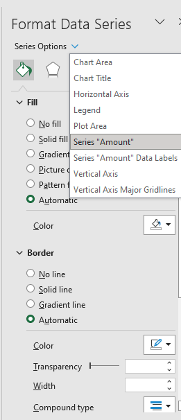
The “Format Data Series” menu appears whenever the chart series is selected. You can choose the Chart Area, Title, Legend, Plot Area, and Series from the dropdown list for customization.
Selecting the Chart Styles
You can utilize the various chart styles present in Excel to quickly decorate your chart and give it a professional look. This is very useful if you need to quickly customize your chart and give it a clean and crisp look, are unsure about utilizing various customization options, or are uncertain of how to proceed with customization.
You need to click on the “Chart Design” menu and then the dropdown button to expand the chart styles in the “Chart Style” group. Once you hover your mouse, the chart styles are applied to your existing chart for a quick preview to select and choose.

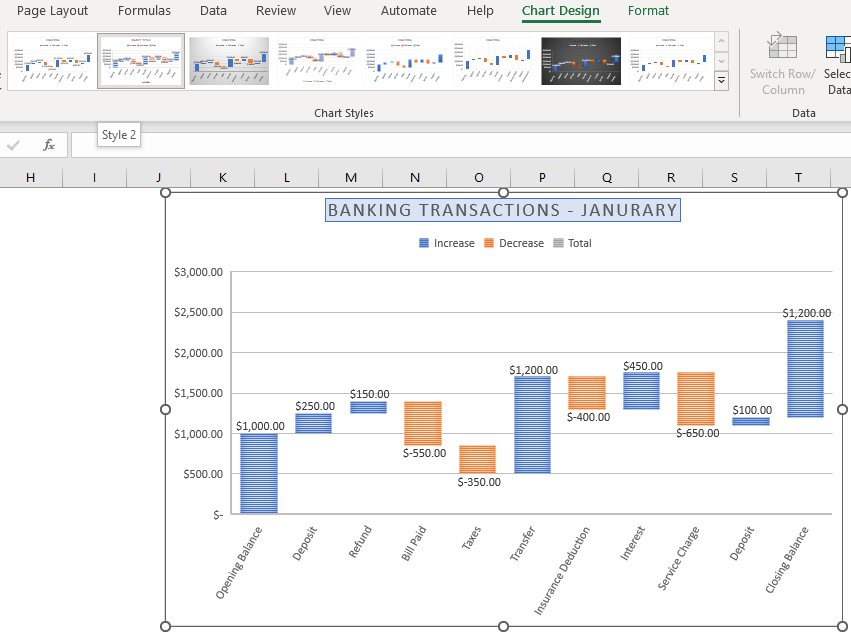
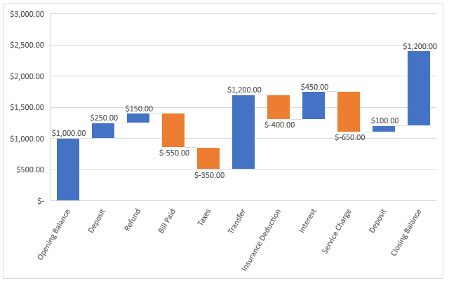
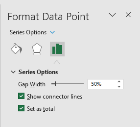
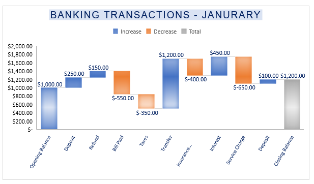
If you notice that the last category in the screenshot, which is the Closing balance, also appears as an increase, which is technically incorrect. Hence we need to set it as “Total” to complete the waterfall chart.
To do so, you need to select the last category on the chart and double-click it, which shall open the “Format Data Series” menu. You need to click on the checkbox for “Set as Total”.
The change would immediately take effect on the waterfall chart. The last category will appear as a total or subtotal instead of adding it to the other values and completing the waterfall chart, as shown below.
Step 6: Analyze your data
Now that you have created your line chart, you can analyze your data to gain insights and draw conclusions. Look for trends and patterns in your data and use your chart to illustrate these findings to your audience.
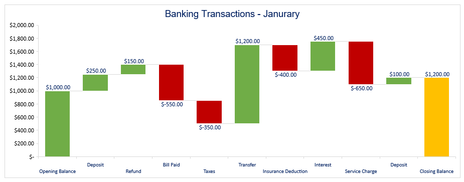
Looking at the plotted chart, we could quickly determine the variations when there were debits or credits in the transaction statement. This is very helpful in analyzing changes in the specific value at a glance. Creating a waterfall chart in Excel may seem daunting at first, but by following these simple steps, you can create a visually appealing and informative chart in no time. So go ahead and impress your audience with your newfound Excel skills!
When should I create a Waterfall chart in Excel?
Waterfall charts help show the individual factors that contribute to a change in value, making it easy to identify trends, patterns, and outliers. They are also helpful for presenting complex data clearly and concisely. Here are some situations where creating a waterfall chart can be particularly helpful:
- Analyzing Financial Data: Waterfall charts are commonly used in finance to show revenue, expenses, or profit changes over time. They can help identify trends and patterns in financial data and provide insights into the factors contributing to changes in financial performance.
- Sales Analysis: Waterfall charts can be used to analyze sales data, showing how the sales figures have changed over time due to different factors such as promotions, discounts, and seasonal variations.
- Process Improvement: You can utilize Waterfall charts to visualize how changes in a process lead to changes in its output. Waterfall charts can help identify bottlenecks or inefficiencies and make targeted improvements.
Important notes about the Waterfall chart in Excel
Here are some of the key features that set waterfall charts apart from other chart types:
- Cumulative Effect: Waterfall charts show the cumulative effect of each change in the data. Each bar in the graph represents a change in value, and the length and position of the bars show the total effect of all changes up to that point.
- Positive and Negative Values: Waterfall charts can handle both positive and negative values, which makes them helpful in showing both increases and decreases in the data.
- Bridge between Bars: Waterfall charts have a "bridge" connecting each bar to the next one, making it easy to see how the data changes over time.
What you may also know: Stacked and Cascade Waterfall charts
Stacked Waterfall Chart: A stacked waterfall chart shows how each category in the data contributes to the overall change in value, similar to a standard waterfall chart we discussed above. However, at least one of the columns in the graph contains more than one values and the total value includes more than one categories and shows their total values.
Cascade Waterfall Chart: A cascade waterfall chart is similar to a normal waterfall chart, but the bars are arranged horizontally instead of vertically. This chart type is often used when you intuitively want to visualize the dataset vertically rather than horizontally.

