How to Create a Box & Whisker Chart in Excel?
In this article, you will learn how to create and use a Box & Whisker Chart in Excel
What is a Box and Whisker Chart in Excel?
A Box and Whisker Chart, also known as a Box Plot, is a type of statistical chart used to display the distribution of a dataset along with key summary statistics. It provides a visual representation of the minimum, first quartile, median, third quartile, and maximum values of a dataset, as well as any outliers or extreme values.
How to create a Box and Whisker Chart in Excel?
In Excel, creating a Box and Whisker Chart involves the following steps:
Step 1: Organize your data in columns or rows. Each column or row should represent a different dataset or category for which you want to create the Box and Whisker Chart. Select the range of data that you want to include in the Box and Whisker Chart, including the category labels and the values.
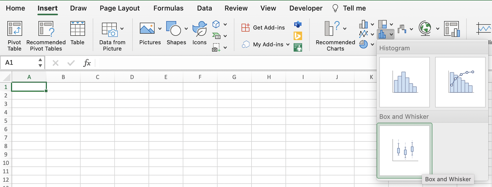
Step 2: Go to the "Insert" tab on the Ribbon in Excel. Within the "Charts" group, click on the "Insert Statistic Chart" button. From the dropdown menu, select the "Box & Whisker" option.
Step 3: After inserting the Box and Whisker Chart, you can customize its appearance and formatting. You can modify chart elements like titles, axes, gridlines, and labels to suit your needs. Right-click on different chart components to access formatting options.
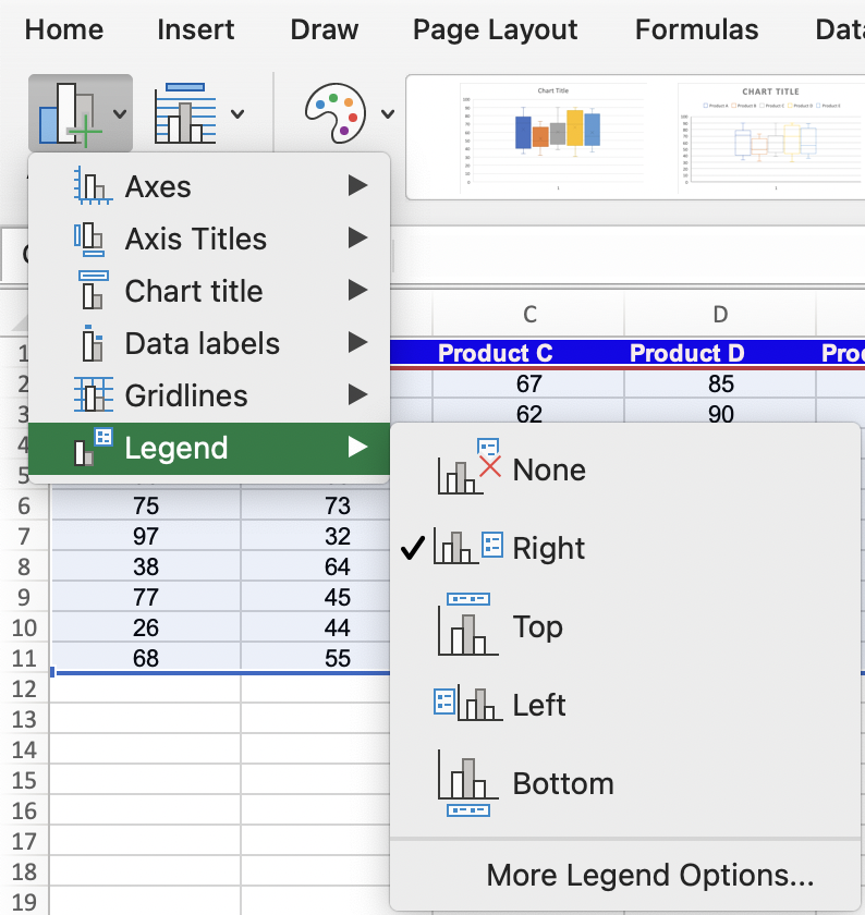
If desired, you can add data labels to the chart to display specific values or statistics, such as quartiles or mean. You can also include a legend or additional information to enhance the interpretation of the chart.
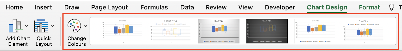
Step 4: You can also customize the colors and layout of the chart according to your preferences or from the pre-defined settings available in Excel.
Analyzing the chart
The Box and Whisker Chart will display boxes representing the interquartile range (IQR), median line, and whiskers extending to the minimum and maximum values. Any outliers or extreme values will be displayed as individual data points or asterisks.
The box represents the middle 50% of the data, with the median line indicating the 50th percentile. The whiskers extend to the minimum and maximum values within the range, excluding outliers.

The Box and Whisker Chart in Excel is a valuable tool for visualizing and comparing distributions, identifying outliers, and understanding the spread and central tendency of a dataset. It provides a clear and concise summary of the data's statistical properties.
What are some uses of the Box & Whisker Chart in Excel?
The Box and Whisker chart, also known as the Box Plot, is a useful visual representation for various analytical purposes. Here are some common uses of the Box and Whisker chart:
- Data Distribution Analysis: The Box and Whisker chart allows you to analyze the distribution of a dataset. It provides insights into the range, quartiles, and median of the data, allowing you to identify skewness, outliers, and the spread of values.
- Comparison of Multiple Datasets: With a Box and Whisker chart, you can compare multiple datasets or categories side by side. This enables you to understand differences in distributions, variations, and central tendencies between different groups.
- Trend Analysis: By creating Box and Whisker charts for a dataset over time, you can observe changes in the distribution of data across different periods. This helps in identifying trends, shifts, or seasonality patterns in the dataset.
- Data Presentation and Reporting: Box and Whisker charts provide a visually appealing and concise way to present complex data distributions and statistics. They are often used in reports, presentations, and data storytelling to effectively communicate data insights.
These are just a few examples of the uses of the Box and Whisker chart. The flexibility and interpretability of this chart make it a valuable tool for data analysis and visualization in various fields and scenarios.

