How to Create a Treemap Chart in Excel
In this article, you will learn about the Treemap Chart and how to create it in Excel.
What is a Treemap chart in Excel?
A Treemap chart in Excel displays hierarchical data in a series of rectangles. Each rectangle represents a category or subcategory, and the size and color of the rectangle reflect the relative value or importance of the category or subcategory. They condense large datasets into visually attractive, easy-to-read charts, facilitating rapid pattern recognition and comparison.
How to make a Treemap chart in Excel
In this article, we will guide you through the steps to create a Treemap chart in Excel.
Step 1: Prepare your data
Before we begin creating a treemap chart, we need to make sure our data is organized properly. This means that our data should be in a table format, with each column representing a different category or data point. For a treemap chart, you will need to have at least two columns of data: one for the categories and another for the values. Make sure your data is organized in a logical manner and that all of the data is entered correctly.
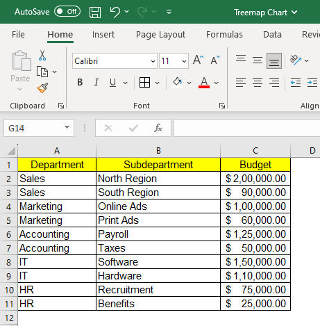
The example dataset taken is for a product company budget allocation figure for the fiscal year. The objective is to determine data trends in terms of the budget allocated to each of the sub-departments.
Step 2: Select your data
Once our data is systematized, we can select the data we want to comprise our treemap chart. To do this, simply click and drag your mouse over the cells containing the data. If you have a large dataset, you can hold down the "Ctrl" key (or “Cmd” on Mac) or click on your top left cell and hold shift and click on your farthest bottom right cell to select multiple ranges of data.

The selected dataset will be highlighted by a border across the text for visual confirmation.
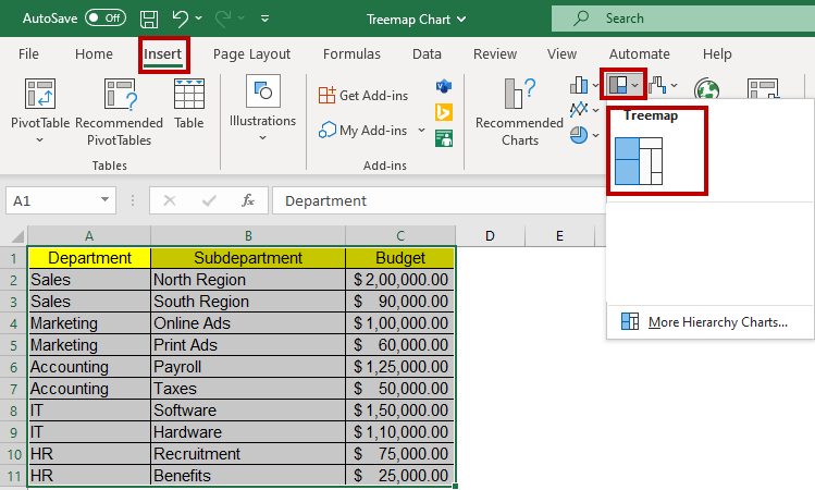
Step 3: Insert the Treemap chart
With our data selected, we can insert a treemap chart into our spreadsheet. To do this, navigate to the "Insert" tab on the Excel ribbon and select “Hierarchy” and then "Treemap Chart" from the chart options.
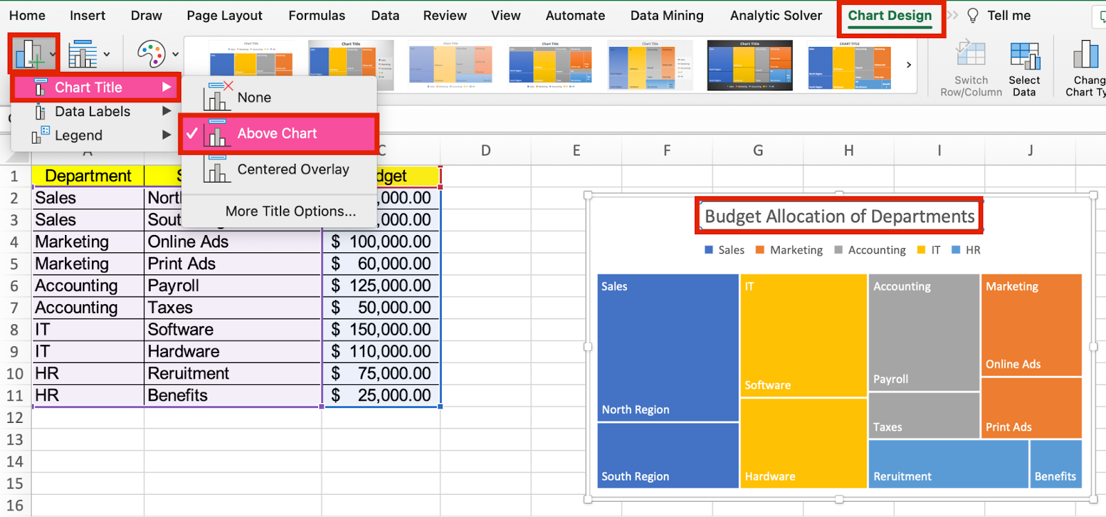
Step 4: Add a chart title and legends
To make your treemap chart more informative, you can add a title and a legend. The title should provide a clear and concise explanation of what the chart represents, while the legend should identify the different categories of data and their corresponding colors. To do this, click on the chart and then navigate to the "Chart Design" tab. From there click the “Add Chart Element” followed by the “Chart Title” option. You can choose the Title layout from the sub-menu.
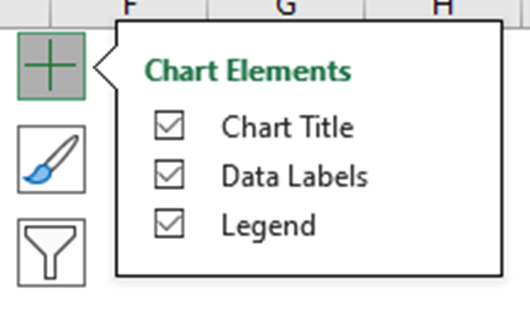
Another way to quickly access “Chart Elements” is to click on the + icon when you select the chart.
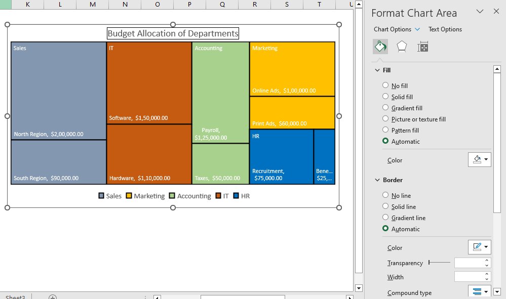
You can rename the Chart Title by clicking on the Title and editing the text directly. The “Format Chart Title” menu appears on the right side of Excel where you can change the background color of the Chart Title, the Transparency options, alignment, and more.

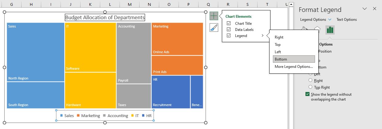
If you click on the legend, then the “Format Legend” menu appears, which lets you define the position of legend appearance over the chart. You can also modify the text font, colors, and background color.
Step 5: Customize your Treemap chart
Once you have inserted a treemap chart, you can customize it to meet your requirements. You can alter the chart's title, axis labels, and legend to provide context for your data. You can also modify the color scheme and chart style to make your chart visually appealing.
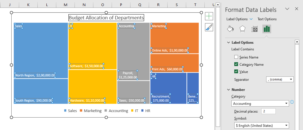
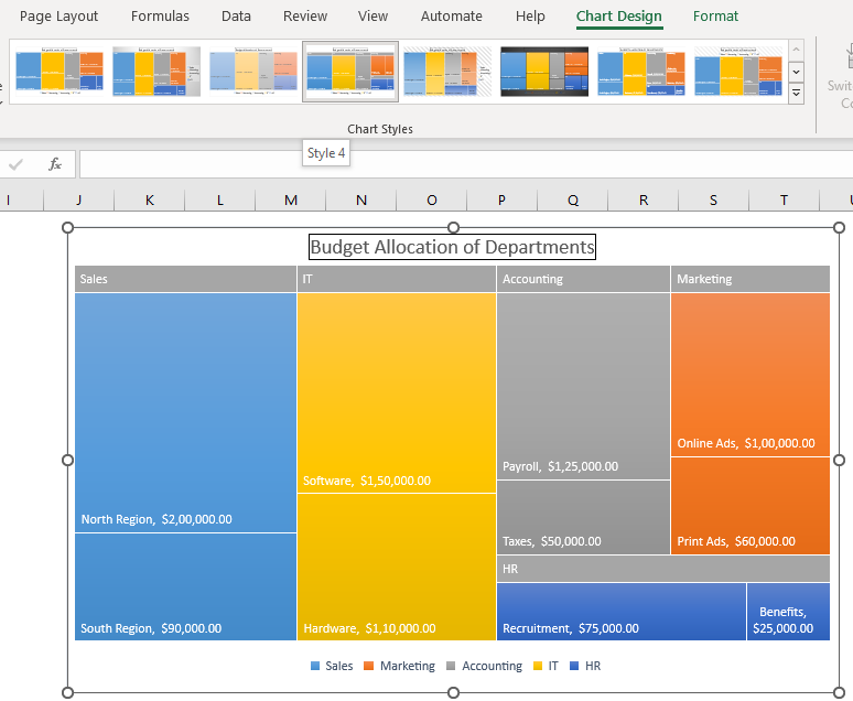
To customize the chart, click on it to select it, then use the options in the "Chart Design" and "Format" tabs in the ribbon. Using the quick access “Chart Elements”, you can enable the “Data Labels” and choose the layout option.
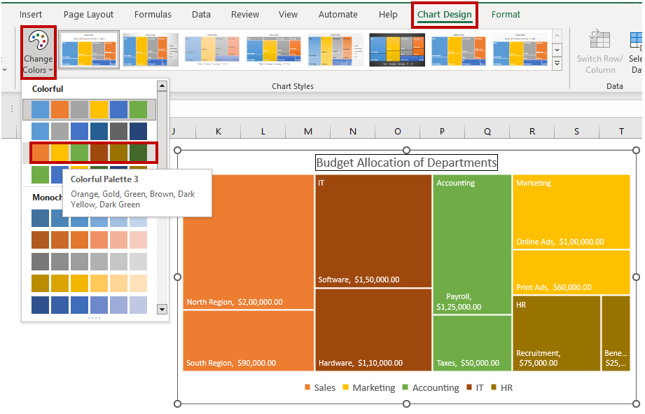
You can set the color scheme using the quick access “Chart Styles” and even choose a desired chart style.
The “Format Data Series” menu appears whenever the chart series is selected. From the dropdown list, you can choose the Chart Area, Title, Legend, Plot Area, and Series for customization.
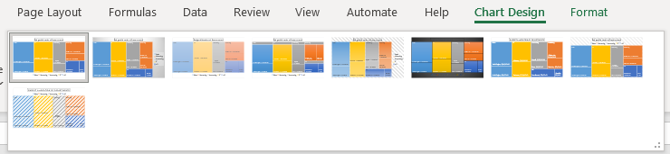
Selecting the Chart Styles
You can use the various chart styles in Excel to quickly give your chart a professional look. This is useful if you need to customize your chart quickly, or if you are not sure how to use the customization options.
To do this, click on the “Chart Design” menu and then click on the dropdown button to expand the chart styles present in the “Chart Style” group. For a quick preview of the chart styles you can hover your mouse over the chart styles and they will be applied on your existing chart temporarily, from there you can select which style works best for your chart.
Step 6: Analyze your data
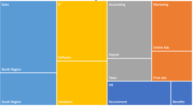
Once you have created your treemap chart, you can analyze your data to gain insights and draw conclusions. Look for trends and patterns in your data, and use your chart to illustrate these findings to your audience.
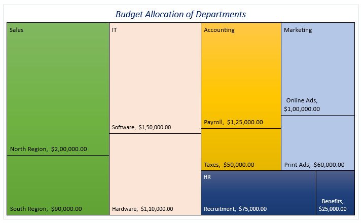
Looking at the plotted chart we could easily determine that the Sales department has received the highest budget allocation for the North region, followed by IT- Software, Accounting- Payroll and Marketing - Online Ads and HR - Recruitment. Data trends are also clearly visible, for example in the HR department most of the allocated budget is reserved for the Recruitment department and benefits lag far behind.
Creating a treemap chart in Excel may seem challenging at first, but by following these simple steps, you can create an informative and visually appealing chart in no time. So go ahead and amaze your audience with your newly acquired Excel abilities!
When should I create a Treemap chart in Excel?
The treemap chart is an excellent option when considering an array of related categories. Here are some moments where treemap charts work best:
- Hierarchical structure: Treemap charts work best when your data has a clear hierarchical structure, with categories and subcategories that can be represented as nested rectangles.
- Large dataset: Treemap charts work great for visualizing large datasets with many categories or subcategories, as they can condense the data into a compact and easy-to-read format.
- Data comparisons: Treemap charts are useful for comparing relative sizes and values of different categories or subcategories, as the size and color of each rectangle can be used to represent the magnitude of the data.
- Visual appeal: Treemap charts are visually appealing and can help to engage and communicate data to a wider audience. Additionally, the representation of data in Treemap charts makes it easier to differentiate between categories and interpret large amounts of data efficiently. They are a space-saving and effective way to display hierarchical data.
Here are some specific use cases where it is helpful to use a Treemap chart:
- Comparing the sales figures of different products over a time period can make up a great two-dimensional treemap chart
- Population Demographics for a certain geographic area over a specific period
- Plotting of the Air Quality Index of the top 10 cities across the world.
- Inventory of various electronic items in a digital store can be easily plotted as a nested treemap chart.
Overall, a Treemap chart can be a good choice when you want to convey a lot of information in a compact and easy-to-read format, while highlighting the relative importance of different categories or subcategories.
Important notes on Treemap charts in Excel
Treemap charts use rectangles to represent data, with each rectangle representing two numerical values. The rectangles can be referred to as nodes or branches, and nested datasets are referred to as leaves.
The dimensions and colors of the rectangles in a Treemap chart are determined based on the quantitative variables associated with each rectangle, with the size of the rectangle being proportionate to the assigned quantity.
Treemap charts are capable of representing multi-layered data, with hierarchical data depicted as a set of nested rectangles, with parent elements tiled with their child elements. The area of the parent category is determined by the sum of its subcategories.
The rectangles in a Treemap chart are arranged by size, with the largest rectangle located in the top left corner and the smallest rectangle located in the bottom right corner. Nested rectangles follow the same order, with lower level rectangles stacked within higher level rectangles.
Treemap charts are not suitable for data sets that vary greatly in magnitude and only positive values can be used as the quantitative variable that determines the size of the rectangles in a Treemap chart.

