How to Create a Sunburst Chart in Excel
In this article, you will learn about the Sunburst Chart and how to create it in Excel.
What is a Sunburst chart in Excel?
A Sunburst chart in Excel is a type of chart that displays hierarchical data as a series of concentric rings, with each ring representing a level of the hierarchy. The chart resembles a pie chart, but with multiple rings that show subcategories within categories.
Each segment of the chart represents a category, and the size of the segment corresponds to the relative value or size of the category. The segments are color-coded to represent subcategories within the categories, and the colors can be customized to make the chart more visually appealing and easier to read.
How to make a Sunburst chart in Excel
In this article, we will guide you through the steps to create a sunburst chart in Excel.
Step 1: Organize your data
To create a sunburst chart, we need to ensure that we have properly organized the data. The data should be in a table format, with each column representing a different category or data point. Make sure your data is organized in a logical and hierarchical manner and that all the data is entered correctly.
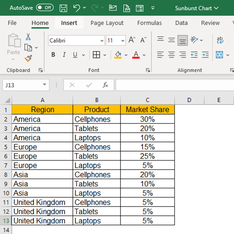
The example dataset taken is of a product company's market share for various products across different geographical regions. The objective is to determine data trends in terms of the market captured across regions by various products and to visualize which products are performing better in comparison to others.
Step 2: Select your data
Now that the data is organized we can go ahead and select the data we want to include in our sunburst chart. To do this, simply click and drag your mouse over the cells containing the data. If you have a large dataset, you can hold down the "Ctrl" key or (“Cmd” on mac) and select multiple ranges of data.
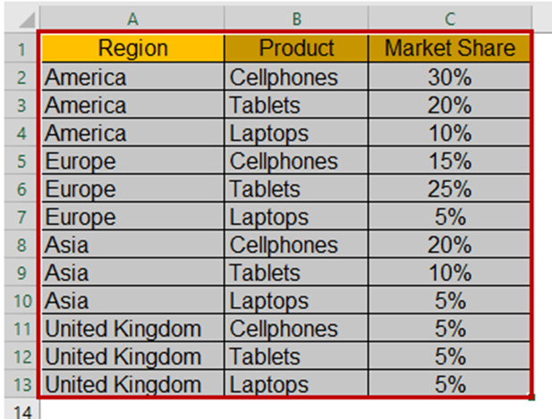
The selected dataset will be highlighted by a border across the text for visual confirmation.
Step 3: Insert the Sunburst chart
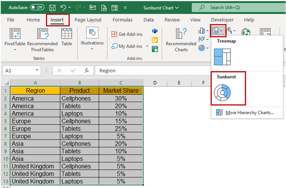
With our data selected, we can now insert a sunburst chart into our spreadsheet. To do this, navigate to the "Insert" tab on the Excel ribbon and select "Sunburst Chart" from the chart options.
Step 4: Add a chart title and legends
You can make your sunburst chart more informative by adding a “title” and a “legend”. Your title should clearly state what the chart represents, whereas the legend should provide insight into the different categories defined by the segments of the sunburst chart. To add a “title” and a “legend” go to the "Chart Design" and use the “Add Chart Element” followed by the “Chart Title” or “Legend” option. If you go to the sub-menu you can pick a title layout.

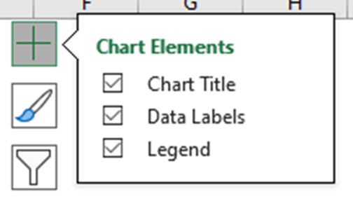
Another way to quickly access “Chart Elements” is to click on the + icon when you select the chart.
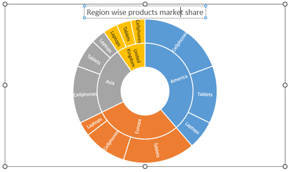
If you wanted to edit your title, a quick option would be to directly click on the title on the chart and edit it. Additionally, the “Format Chart Title” menu appears on the right side of Excel where you can change the background color of the Chart Title and set the Transparency options.
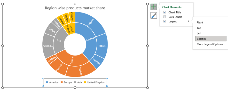
If you click on the Legends, then the “Format Legend” menu appears, which lets you define the position of legend appearance over the chart. You can also modify the text font, colors, and background color.
Step 5: Customize your Sunburst chart
Once you have inserted your sunburst chart, you can tailor it to your needs. You can change the chart title, axis labels, and legend to provide context for your data. You can also modify the color scheme and chart style to make your chart visually appealing.
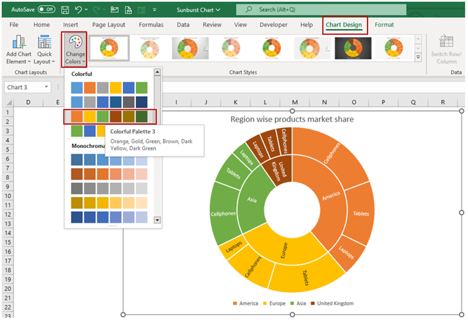
To customize the chart, click on it to select it, then use the options in the "Chart Design" and "Format" tabs in the ribbon. Using the quick access “Chart Elements”, you can enable the “Data Labels” and choose the layout option.
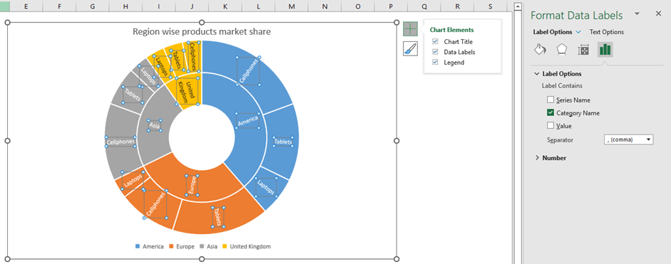
You can set the color scheme using the quick access “Chart Styles” and even choose a desired chart style.
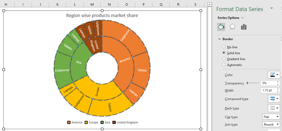
The “Format Data Series” menu appears whenever the chart series is selected. From the dropdown list, you can choose the Chart Area, Title, Legend, Plot Area, and Series for customization.
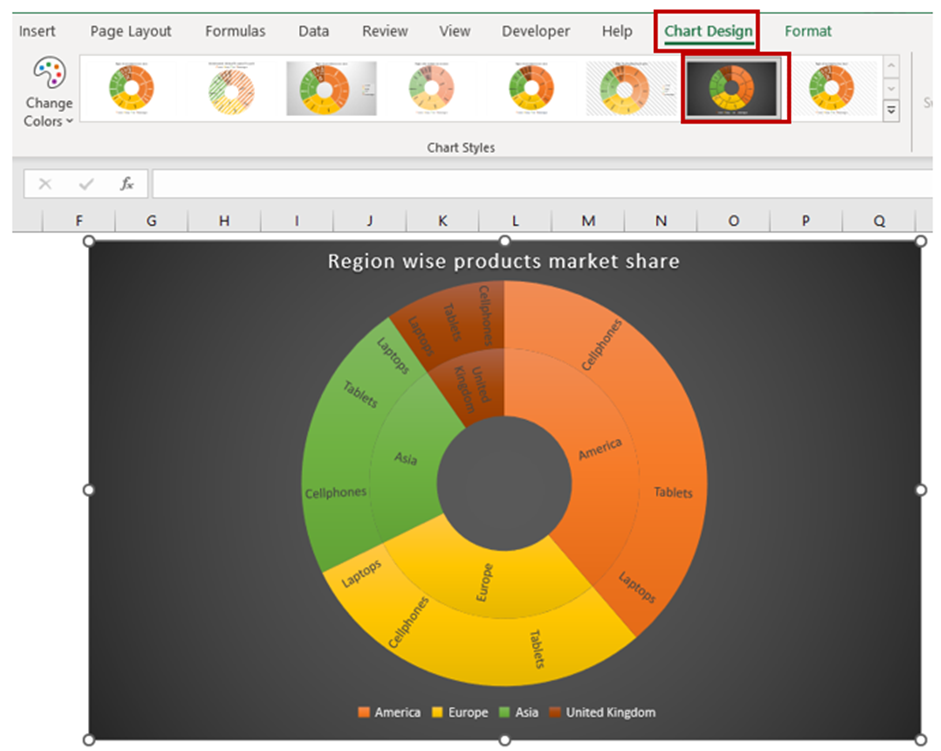
Selecting the Chart Styles
Excel has a variety of chart styles that you can quickly and easily apply to your charts. These styles can help give your chart a professional and well-put-together look. These styles can be especially helpful if you are having trouble with customizing your chart on your own. To do this, go to the “Chart Design” tab and then click on the dropdown button to expand the chart styles present in the “Chart Style” group.

Step 6: Analyze your data
Now that you have created your sunburst chart, you can examine your chart to gain insights and draw conclusions about your data. Look for trends and patterns and use your chart to present these findings to your audience.
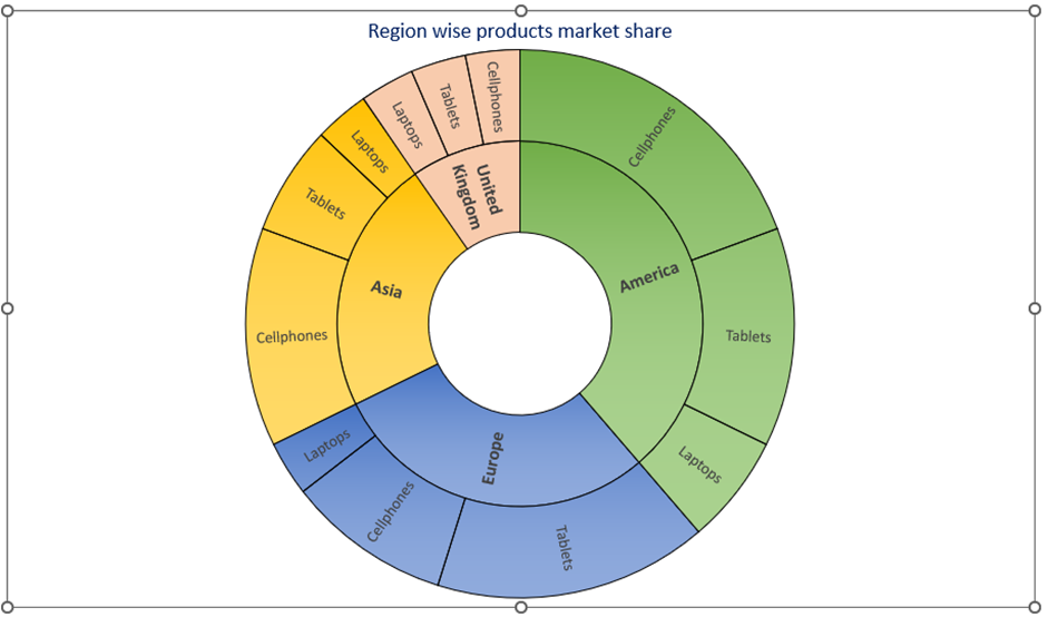
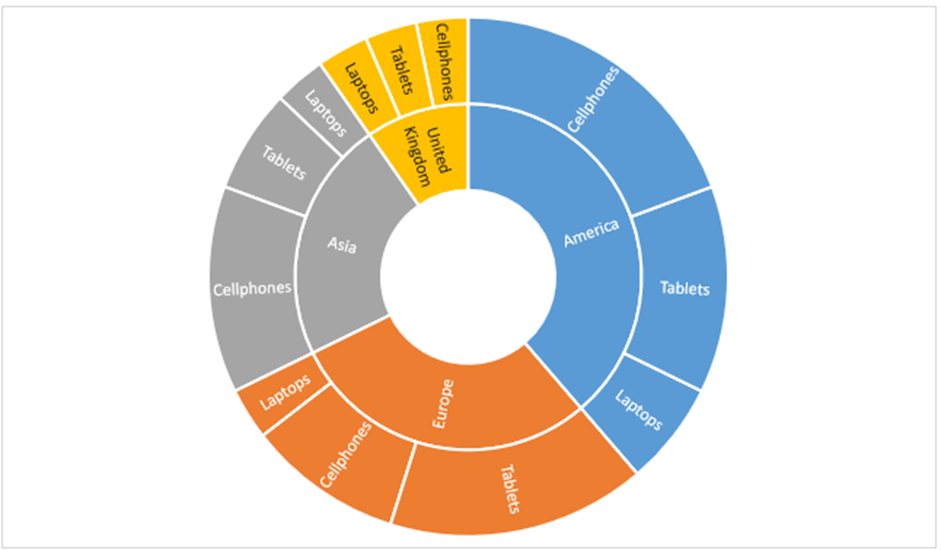
Looking at the plotted chart we could easily determine that the company's performance has been quite good in the American region in terms of Cellphones and Tablets market share. Cellphones have been the company's best-selling product, contributing to market share across regions.
It may seem challenging to create a sunburst chart in Excel, but by following these simple steps, you can create a well-made and informative chart in no time. So go ahead and impress your audience with your newfound Excel skills!
When should I create a Sunburst chart in Excel?
Sunburst charts are a type of hierarchical chart that display data as a series of rings, with each ring representing a different level of a hierarchy. Sunburst charts are helpful when you want to visualize how different categories or subcategories contribute to an overall value, and how those categories are related to each other. Here are some situations where you might want to use a sunburst chart in Excel:
- Budget analysis: Use a sunburst chart to visualize how different budget categories contribute to overall spending, and how those categories are broken down into subcategories.
- Sales analysis: Use a sunburst chart to visualize how different product categories contribute to overall sales, and how those categories are broken down into subcategories.
- Organizational structure: Use a sunburst chart to visualize how different departments or teams contribute to overall performance, and how those teams are organized within the organization.
- Website traffic: Use a sunburst chart to visualize how different website pages or sections contribute to overall traffic, and how those pages are organized within the website hierarchy.
Overall, sunburst charts are a useful tool for visualizing hierarchical data and identifying patterns or relationships between different categories or sub-categories. They can be particularly effective when there are multiple levels of hierarchy and you want to see how each level contributes to the overall value.
Notes on the Sunburst chart in Excel
Some things to consider when creating a sunburst chart in Excel include:
Color coding: You can use different colors to represent different levels of the hierarchy in a sunburst chart. This can help to make it easier to distinguish between different levels and categories and to see how they are related to each other.
Label placement: Depending on the size and complexity of your sunburst chart, you may want to adjust the placement of category labels. For example, you may want to place labels within each section of the chart, or outside the chart with connecting lines.
Overall, the elements of a sunburst chart should be carefully chosen to ensure that the chart accurately represents the hierarchy of the data and is easy to read and understand. With this in mind, you can create a sunburst chart that effectively communicates the relationships between different categories and subcategories and help users gain valuable insights and make informed decisions based on complex data.

