How to Create a Clustered Bar Chart in Excel
In this article, you will learn about the Clustered Bar Chart and how to create it in Excel.
What is a Clustered Bar chart in Excel?
A Clustered Bar is an effective visualization tool for illustrating the relationships between multiple data series. In a Clustered Bar chart, the bars are grouped side by side within each category, forming clusters. Each cluster represents a distinct data series or a sub-category, and the height of each bar represents the value of the data being displayed. The bars within a cluster are arranged in parallel lines, making it easy to compare values both within a cluster and across different clusters.
How to make a Clustered Bar chart in Excel
Step 1: Organize your data
Before we can make our clustered bar chart, we need to make sure our data is organized in tabular format such that each column represents a different category or data point. His can be seen in the image below.
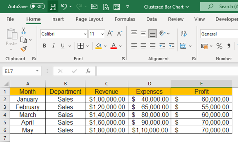
The example dataset above is for the Sales department showing month wise revenue, expenses and profit booked by the department. The objective is to visualize the amounts booked under each header and compare with other months.
Step 2: Select your data
Once our data is properly organized, we can select the data we want in our Clustered Bar chart. To do this, simply click and drag your mouse over the cells containing the data. If you have a large dataset, you can hold down the "Ctrl" key (or “Cmd” on Mac) and select multiple data ranges or you can select your top most left cell in your table and hold shift and select your bottom most right cell.

The dataset chosen will be highlighted by a border across the text for visual confirmation.
Step 3: Insert the Clustered Bar chart
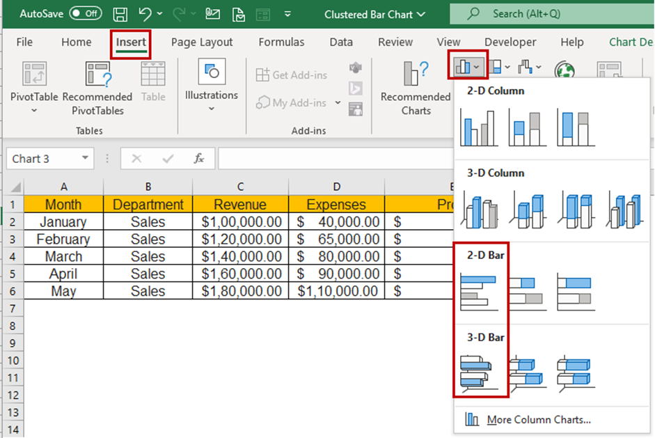
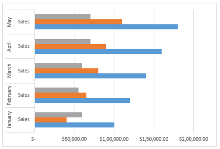
With our data selected, we can now insert a Clustered Bar chart into our spreadsheet. To do this, navigate to the "Insert" tab in Excel and select "Clustered Bar Chart" from the chart options. You can choose from other chart types such as 3D Clustered Bar.
Step 4: Add a chart title and legends
To enhance the informativeness of your stacked bar chart, consider incorporating a “title” and a “legend”. The title should provide the chart's subject matter, whereas the legend is meant to identify the categories represented by the chart's various segments. To insert a title and/or legend, first, click on the chart to select it. Then, go to the “Chart Design” tab and click the “Add Chart Element” option, then select the “Chart Title” option. From there, the menu provides a choice of Title layout.
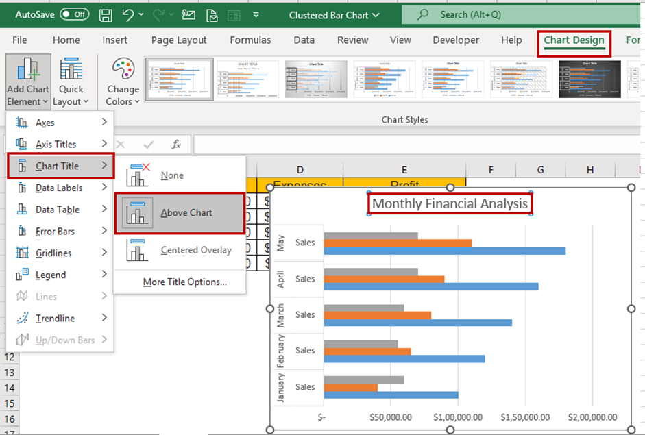
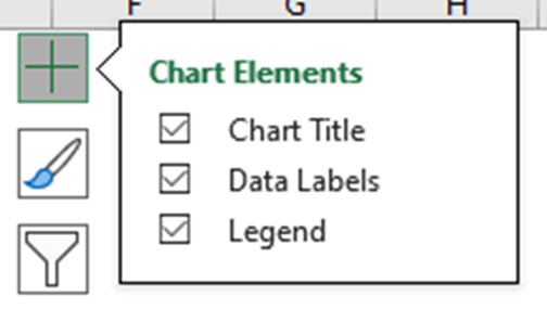
Another way to quickly access “Chart Elements” is to click on the + icon at the top right corner when you select the chart.
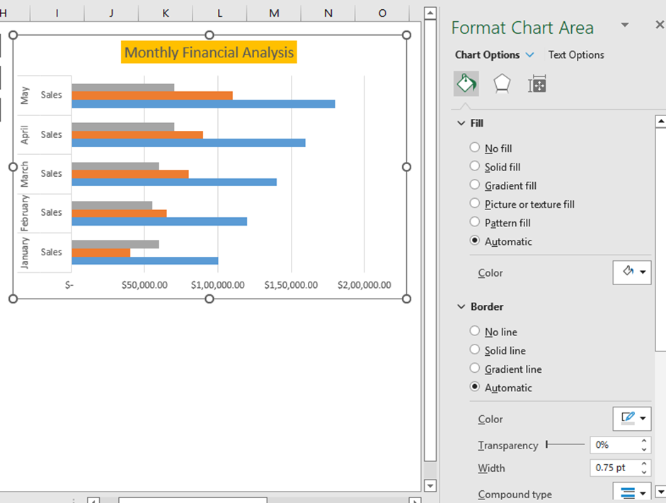
You can rename the Chart Title by clicking on the Title and editing the text directly. The “Format Chart Title” menu appears on the right side of Excel, where you can change the Chart Title's background color and set the Transparency options.
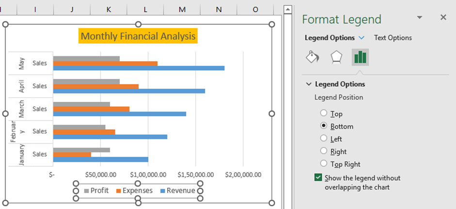
If you click on the Legends, then the “Format Legend” menu appears, which lets you define the position of legend appearance over the chart. You can also modify the text font, colors, and background color.
Step 5: Customize your Clustered Bar chart
After inserting your Clustered Bar chart, you can tailor it according to your needs. As mentioned earlier, you have the option to modify the chart title, axis labels, and legend to offer more context regarding your data. Additionally, tweaking the color palette and chart style can enhance its visual allure.
To begin customizing the chart, click on it to select it and then explore the myriad of options available under the "Chart Design" and "Format" tabs. You can enable the “Data Labels” through the “Chart Elements” and choose a layout option quickly.
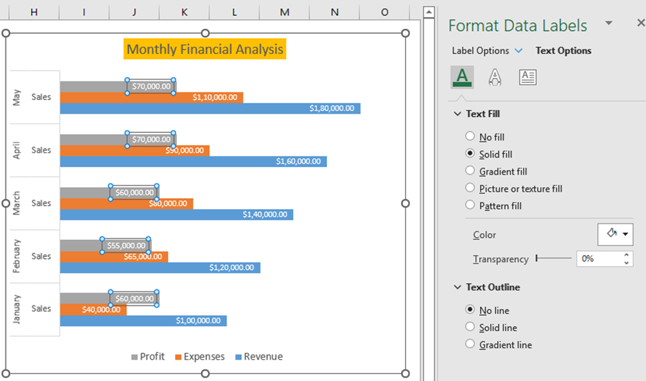
You can set the color scheme using the quick access “Chart Styles” and choose a desired chart style.
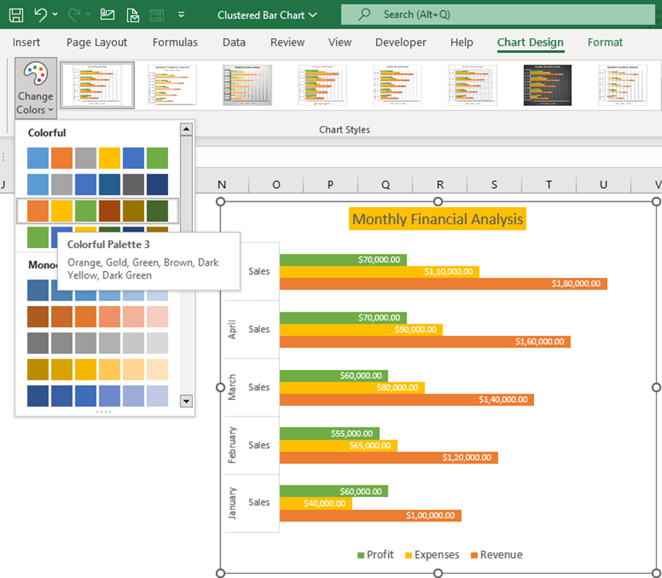
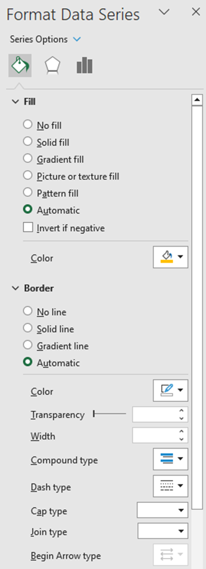
The “Format Data Series” menu appears whenever the chart series is selected. From the dropdown list, you can choose the Chart Area, Title, Legend, Plot Area, and Series for customization.
Selecting the Chart Styles
Excel offers an array of chart styles that can be employed to swiftly embellish your chart, giving it a polished appearance. This comes in handy particularly when there’s an urgency to customize your chart for a sleek look but there’s confusion regarding how to make use of different customization options or the steps to follow.
To access these styles, click on the “Chart Design” menu followed by the dropdown button which reveals the chart styles within the “Chart Style” group. Hovering your mouse over these styles will temporarily apply them to your current chart, giving you a quick preview, and thereby aiding in making an informed selection.

Step 6: Analyze your data
Now that you have created your clustered bar chart, you can analyze your data to gain insights and draw conclusions. Look for trends and patterns in your data and use your chart to illustrate these findings to your audience.

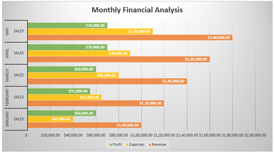
Looking at the plotted chart, we could quickly visualize the profits generated across various months in comparison to each other and expenses, revenue for each month.
Creating a Clustered Bar chart in Excel may seem daunting initially, but by following these simple steps, you can create a visually appealing and informative chart in no time. So go ahead and impress your audience with your newfound Excel skills!
When should you create a Clustered Bar chart in Excel?
One should consider creating a clustered bar chart in Excel under the following circumstances:
- Data comparison: When you want to compare values across different categories or sub-categories, a Clustered Bar chart is a suitable choice. It allows you to visually analyze and compare the magnitudes or values of data series within each category.
- Tracking progress or trends: When you need to track changes or observe trends over time, a Clustered Bar chart can be helpful. By plotting data series over different time periods or intervals, you can easily identify patterns or variations in the data.
- Presentation and reporting: Clustered Bar charts are commonly used in business presentations, reports, and dashboards to convey information in a visually appealing and understandable way. They provide a clear representation of data relationships and make it easier for the audience to interpret and grasp the information.
Remember, the choice to create a Clustered Bar chart depends on the nature of your data and the specific insights you want to communicate. It is essential to select the chart type that best suits your data visualization needs and effectively communicates the intended message.
Important note about Clustered Bar charts in Excel
Something to keep in mind when working with clustered bar charts in Excel is that they become visually complex as the number of categories or data series increase. They work best in situations where data points are limited. Some other things to consider are avoiding 3D effects and overlapping. It is suggested to avoid using 3D effects in a Clustered Bar Chart as they can distort the visual representation and make it harder to interpret the data accurately. And careful construction of the chart is important to prevent overlap between bars and categories, ensuring that the chart remains visually clear and unambiguous.
Advantages and Disadvantages of the Clustered Bar Chart
Advantages:
- It offers simplicity and versatility.
- It is valuable for visually representing data changes over a specific time period.
- Creating and comprehending the chart is straightforward.
- It facilitates easy comparison of multiple categories and subcategories.
- Particularly beneficial when dealing with smaller data categories.
Disadvantages:
- Occasionally, the chart can become cluttered and visually intricate when there are numerous categories or added series.
- Clustered column charts can pose challenges in interpretation, especially when dealing with large datasets, potentially leading to confusion.
- There is a risk of overlapping multiple sub-series within the chart.
- It may not always be feasible to fit all the data into a single chart.

