How to Create a Radar Chart in Excel
In this article, you will learn about the Radar Chart and how to create it in Excel.
What is a Radar chart in Excel?
A Radar chart in Excel, also known as a spider or web chart, displays multivariate data as a two-dimensional chart. It is called a Radar chart because the chart resembles a spider web, with multiple lines radiating from a central point, representing different variables or categories.
Each variable is plotted on its own axis, and the value of each variable is represented by a point on the axis. The points for each variable are then connected by a line to create a polygon shape. This polygon shape helps to visually compare and analyze the values of each variable across different categories or groups.
How to make a Radar chart in Excel
In this article, we will guide you through the steps to create a Radar chart in Excel.
Step 1: Organize your data
Before we begin creating our Radar chart, we need to make sure our data is organized properly. This means that our data should be in a table format, with each column representing a different category or data point. For a Radar chart, you will need to have at least two columns of data. It lets you compare multiple items against multiple criteria. Make sure your data is organized in a logical manner and that all of the data is entered correctly. Additionally, the data should be scaled appropriately. The values in each column should be scaled so that they all fall within the same range. This will ensure that the radar chart is visually appealing and easy to interpret.
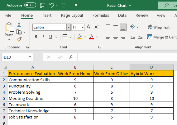
The example dataset taken is of a working model performance evaluation survey of a company, for employees working from home, office and hybrid model on various parameters. The objective is to compare the performance of employees among all these three models and choose the one delivering optimum performance on all set parameters.In terms of data preparation, you need to ensure a clean, formatted, and consistent dataset.
Step 2: Select your data
Once our data is organized, we can select the data we want to include in our Radar chart. To do this, simply click and drag your mouse over the cells containing the data. If you have a large dataset, you can hold down the "Ctrl" key (or “Cmd” on Mac) and select multiple ranges of data.
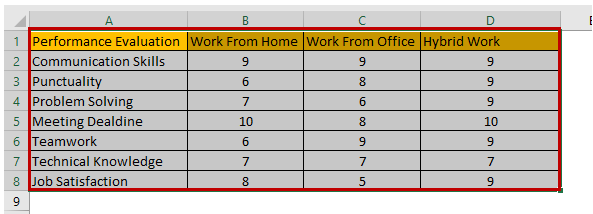
The selected dataset will be highlighted by a border across the text for visual confirmation.
Step 3: Insert the Radar chart
With our data selected, we can now insert a Radar chart into our spreadsheet. To do this, navigate to the "Insert" tab and select "Radar Chart" from the chart options. You can choose from a variety of Radar chart types, including “Radar with markers” and “Filled Radar”.

Step 4: Add a chart title and legends
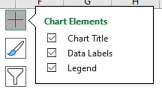
To make your Radar chart more informative, you can add a “title” and a “legend”. The title should clearly state what the chart represents, while the legend should provide information about the categories defined by the different segments of the graph. To add a title and legend go to the “Chart Design” tab and click on the “Add Chart Element” followed by the “Chart Title” option and “Legend”. You can choose the title and legend layout from the sub-menu.
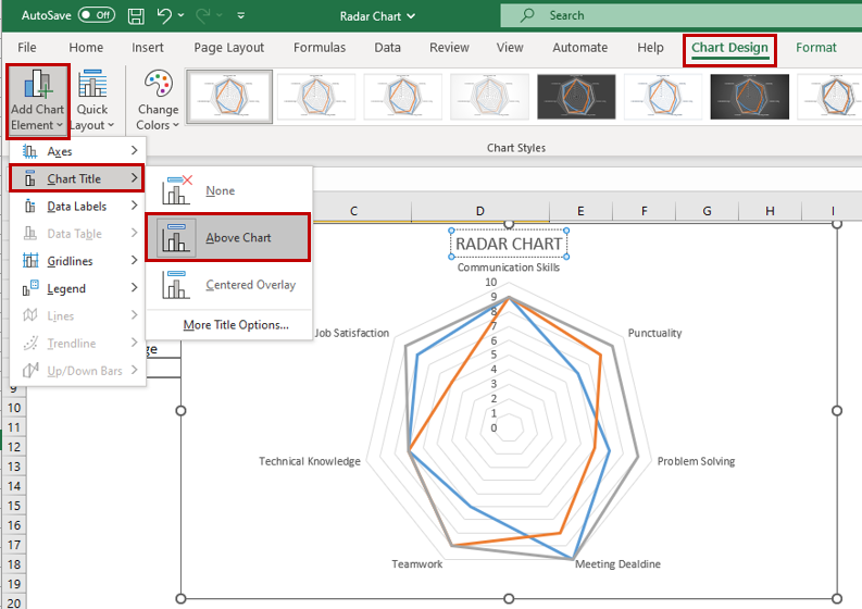
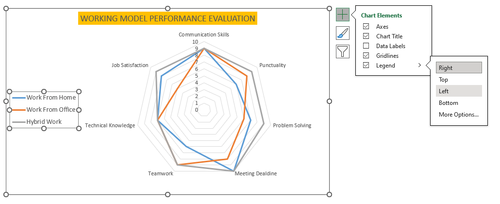
Another way to quickly access “Chart Elements” is to click on the + icon when you select the chart.
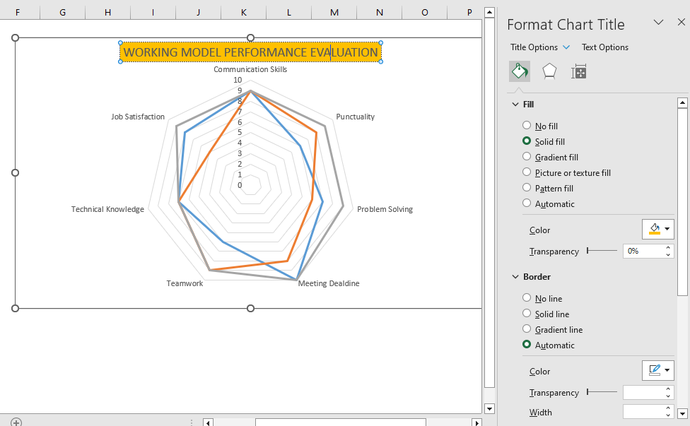
You can rename the Chart Title by clicking on the title on the chart and editing the text directly. The “Format Chart Title” menu appears on the right side of Excel where you can change the background color of the Chart Title, set the Transparency options, and more.
If you click on the Legends, then the “Format Legend” menu appears, which lets you define the position of legend appearance over the chart. You can also modify the text font, colors, and background color.
Step 5: Customize your Radar chart
Once you have inserted your radar chart, you can customize it to meet your needs. As mentioned earlier, you can change the chart title, axis labels, and legend to provide context for your data. You can also adjust the color scheme and chart style to make your chart more visually appealing.
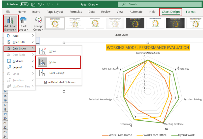
To customize the chart, click on it to select it. Then, use the options in the "Chart Design" and "Format" tabs. You can also use the "Chart Elements" drop-down menu to add or remove data labels, and to choose whether to show data labels as callouts.
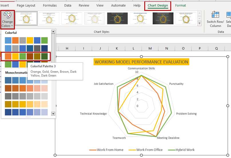
You can set the color scheme using the quick access “Chart Styles” and even choose a desired chart style.
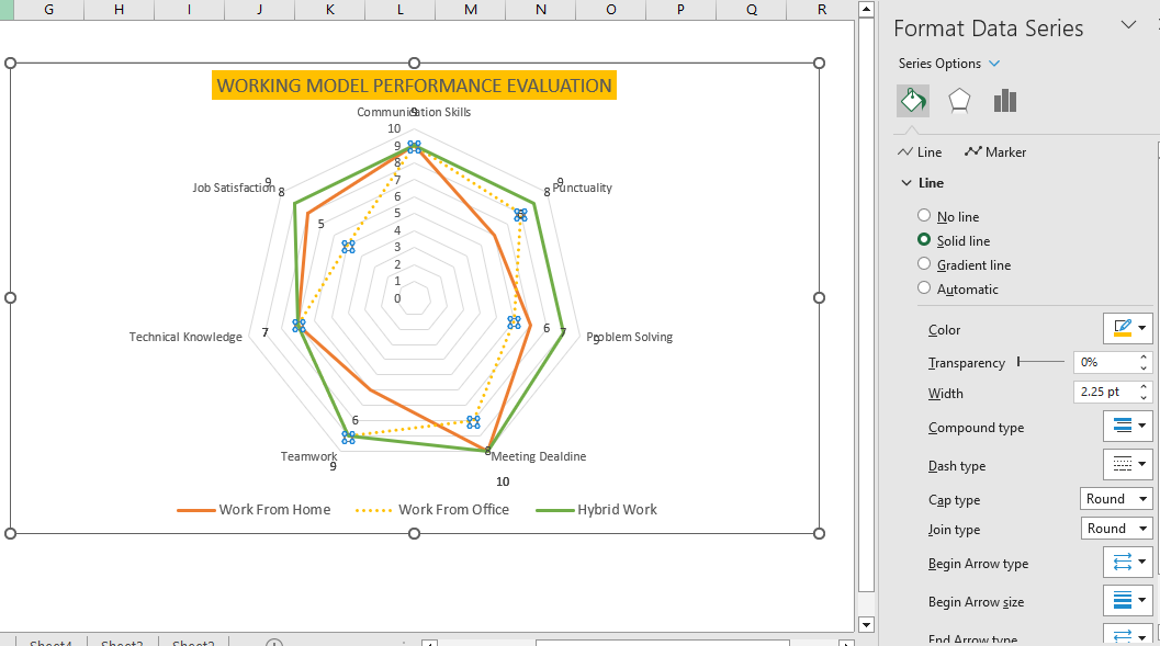
The “Format Data Series” menu appears whenever the chart series is selected. From the dropdown list, you can choose the Chart Area, Title, Legend, Plot Area, and Series for customization.
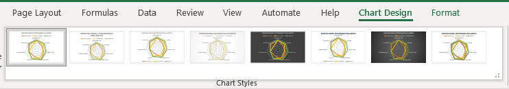
Selecting the Chart Styles
Excel offers a variety of chart styles that you can use to quickly and easily customize your charts. This is a great way to give your charts a professional look, even if you're not sure how to customize them yourself.
To use chart styles, simply click on the "Chart Design" menu and then select a style from the "Chart Style" group. You can also preview the different styles by hovering your mouse over them. Once you've selected a style, it will be applied to your chart immediately. You can then adjust the style as needed by changing the colors, fonts, and other elements.
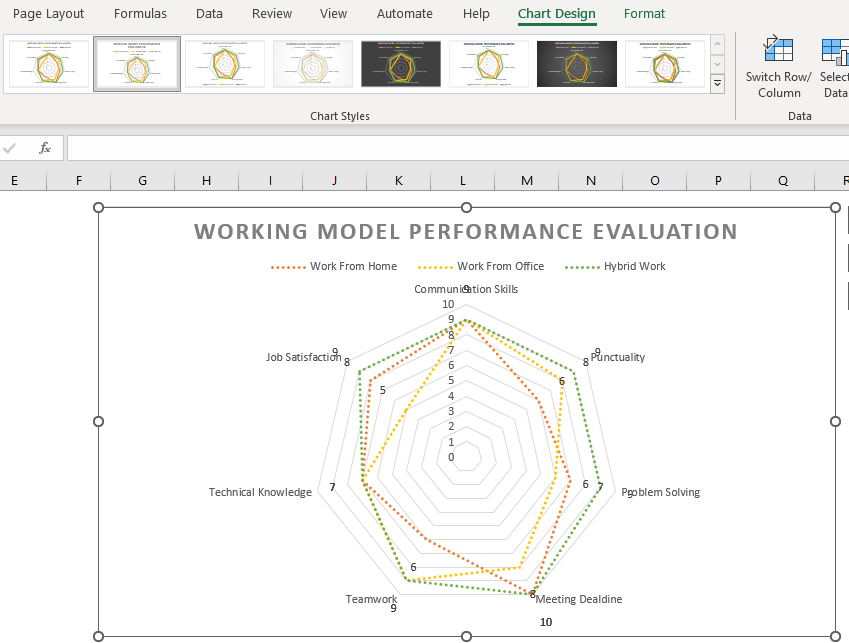
Step 6: Analyze your data
Once you have created your line chart, you can use it to analyze your data and identify trends and patterns. These insights can help you draw conclusions about your data and make informed decisions. You can then use your chart to illustrate these findings to your audience.
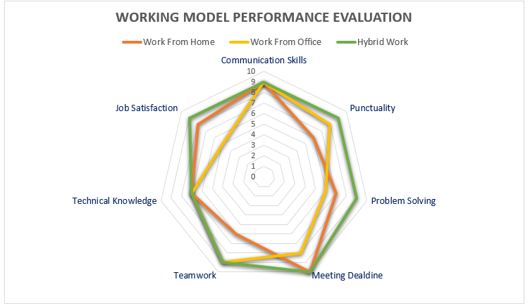
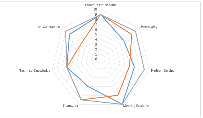
Looking at the plotted chart we could easily determine that the Hybrid working model for employees is outperforming on all the parameters compared to work from office and work from home models.Some interesting trends also appear from the same, that the Job Satisfaction is more in Hybrid model followed by Work from home model as compared to work from office.
Creating a radar chart in Excel can be intimidating at first, but it's actually quite simple. Just follow these steps, and you'll be creating beautiful and informative charts in no time. Impress your audience with your newfound Excel skills!
When should I create a Radar chart in Excel?
Radar charts can be useful when you want to compare multiple variables across different categories. They are particularly effective when you want to illustrate how different variables contribute to an overall score or performance metric. Here are some situations where you might want to use a radar chart in Excel:
- Performance evaluation: Use a radar chart to visualize how an individual or team is performing across multiple criteria, such as sales targets, customer satisfaction, and productivity.
- Product comparison: Use a radar chart to compare different products or services based on various attributes, such as price, quality, and features.
- Risk analysis: Use a radar chart to illustrate the probability and impact of different risks in a project or business scenario.
- Marketing analysis: Use a radar chart to show how different marketing channels or tactics contribute to achieving marketing goals, such as brand awareness or lead generation.
Overall, radar charts can be a useful tool when you want to visualize multiple variables in a way that highlights their relative strengths and weaknesses. However, it's important to ensure that your data is well-suited for this type of chart and that the chart is easy to read and interpret
Important note about Radar chart in Excel
Radar charts, also known as spider charts or star charts, have some unique parameters that differentiate them from other types of charts. These include:
Multiple axes: Radar charts have multiple axes, usually three or more, that originate from the same point and extend outward like spokes on a wheel. These axes represent different variables or categories that are being compared.
Closed shape: When data is plotted on a radar chart, it creates a closed shape, usually a polygon. The shape can be irregular, depending on the values being plotted, and the area of the shape can be used to indicate the overall performance or score.
Circular layout: Radar charts are typically arranged in a circular layout, with each axis spaced equally around the center point. This makes it easy to compare different categories or variables at a glance.
Axis labels: Since radar charts have multiple axes, each axis needs to be labeled clearly to indicate the variable or category being measured. These labels are typically placed at the end of each axis.
Data range: Radar charts often use a fixed data range for all axes to ensure that data is plotted consistently across the chart. This can make it easier to compare different data points and see patterns or trends.
Overall, radar charts offer a unique way to visualize data across multiple categories or variables. They can be particularly useful when comparing performance or scores across different criteria or when trying to identify patterns or trends in complex data sets.
Advantages and Limitations of Radar Chart
Advantages:
- Visual Comparison: A radar chart can be used to compare multiple variables at once. By plotting data on multiple axes, it becomes easy to see how one variable affects another. This makes it a useful tool for decision-making and strategic planning.
- Highlighting Patterns: Radar charts can be useful for highlighting patterns and trends in data. By plotting data over time or across different categories, you can quickly spot trends and identify areas that require attention.
- Showcasing Strengths and Weaknesses: The radar chart can be useful in showing the strengths and weaknesses of different items. For example, if you are comparing different products or services, a radar chart can help you identify which ones are performing well and which ones need improvement.
Limitations:
- Limited Data Range: One limitation of the radar chart is that it has a limited data range. Since the chart is circular, it is difficult to display more than a few variables at a time. This can make it challenging to display complex data sets.
- Misleading Scaling: If the scaling of the axes is not consistent, a radar chart can be misleading. For example, if one axis is scaled differently from the others, it can make one variable appear more important than it actually is.
- Difficulty in Interpretation: The interpretation of radar charts can be difficult for some users. If the data is not presented in a clear and easy-to-understand manner, it can be challenging to draw meaningful insights from the chart. Additionally, people with visual impairments may have difficulty interpreting the chart.

