How to Create a Stacked Column Chart in Excel
In this article, you will learn about the Stacked Column Chart and how to create it in Excel.
What is a Stacked Column chart in Excel?
The Excel stacked column chart displays data in vertical columns, with each column representing a category of data. The columns are stacked on top of each other, allowing for easy comparison of values within each category and across different categories.
In a stacked column chart, the height of each column represents the value of the data it represents. The total height of a column is determined by the sum of the values in each category. Each category is represented by a separate color within the column, and the height of the colored segments within the column represents the proportion of the total value contributed by each category.
Stacked column charts are commonly used to compare the total value of different categories and analyze their composition. They are particularly useful when you want to show both the individual values within a category and the overall contribution of each category to the total. This chart type is often used in financial analysis, sales reports, and survey results analysis, among other applications.
How to make a Stacked Column chart in Excel
In this article, we will guide you through the steps to create a Stacked Column chart in Excel.
Step 1: Organize your data
When creating a stacked column chart, it is important ot organize the data in a table format Each column should represent a different category or data point. It is also essential to format the data correctly like using the currency format for values presented in data.
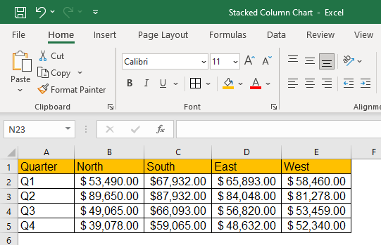
The example dataset displays the company quarterly sales by region classified into North, West, South, East. The objective is to compare the sales figures generated in each quarter across the region. In terms of data preparation, you need to ensure a streamlined dataset.
Step 2: Select your data
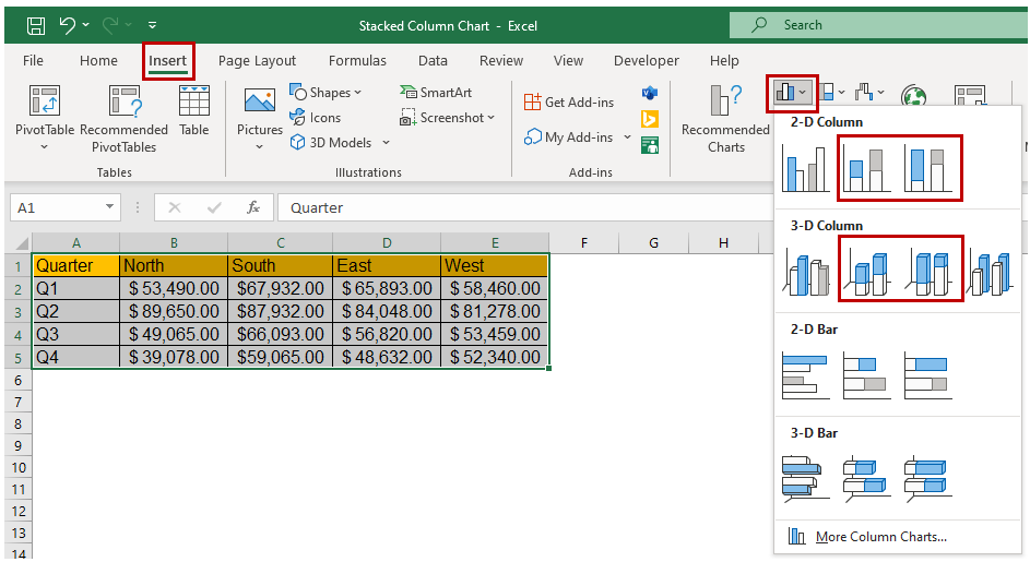
Once the data is organized, you can select the data you want to include in the stacked column chart by clicking and dragging your mouse over the cells containing the data. If you have a large dataset, you can hold down the "Ctrl" key (or "Cmd" on Mac) and select multiple data ranges.

The selected dataset will be highlighted by a border across the text for visual confirmation.
Step 3: Insert the Stacked Column chart
We can insert a stacked column chart into our spreadsheet with the chosen data. To do this, navigate to the "Insert" tab and select "Column Chart" from the chart options. You can choose from various column chart types, including stacked, 100% Stacked, 3D stacked, 3D 100% stacked etc. which can allow for different insights into the data.

Step 4: Add a chart title and legends
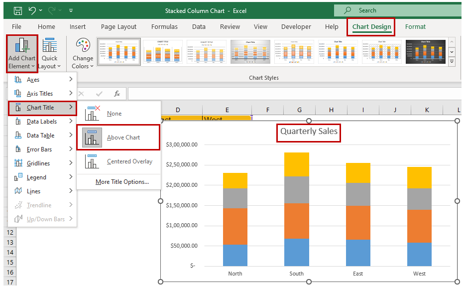
You can add a “title” and a “legend” to make your stacked column chart more informative. The title should clearly state what the chart represents, while the legend should provide information about the categories defined by the different segments of the graph. To add a title and legend, click on the chart to select it, then in the "Chart Design" tab use the “Add Chart Element” followed by the “Chart Title” option. You can choose the Title layout from the sub-menu.
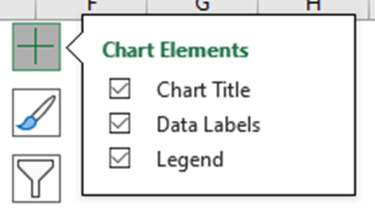
Another way to quickly access “Chart Elements” is to click on the + icon at the top right corner when you select the chart.
You can rename the Chart Title by clicking and editing it directly in the chart area. The “Format Chart Title” menu appears on the right side, where you can change the Chart Title's background color, border, or even set the Transparency options.
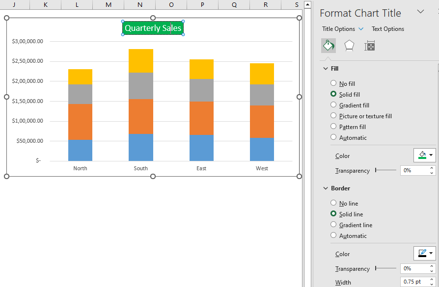
Clicking on the legend will open the "Format Legend" menu, which allows you to customize the legend's appearance. You can change the legend's position, text font, colors, and background color.

Step 5: Customize your Stacked Column chart
After you have inserted a stacked column chart, you can customize it to meet your needs. As mentioned above, you can change the chart title, axis labels, and legend to provide context for your data. You can also adjust the color scheme and chart style to make your chart visually appealing.
To customize the chart, select it and then use the options in the "Chart Design" and "Format" tabs. You can also use the quick access "Chart Elements" to enable "Data Labels" and choose a layout option.
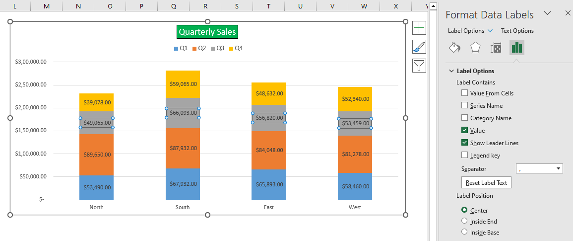
You can set the color scheme using the quick access “Chart Styles” and choosing a desired style.

The “Format Chart Area” menu appears whenever the chart is selected. You can choose the Chart Area, Title, Legend, Plot Area, and Series from the dropdown list for customization.
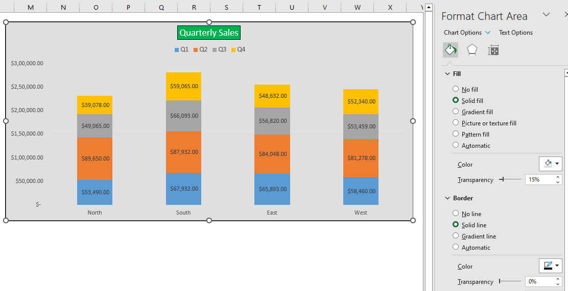
Selecting the Chart Styles
Excel offers a variety of chart styles that you can use to quickly and easily customize your charts. This can be a great way to give your charts a professional look.
To use chart styles, click the "Chart Design" tab and then select a style from the "Chart Styles" group. You can also preview different styles by hovering your mouse over them.


Step 6: Analyze your data
Now that you have created your column chart, you can use it to analyze your data and gain insights. With this you can look for trends in your data and illustrate these findings to your audience.
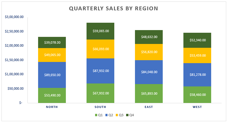
Looking at the plotted chart, we can quickly determine that Quarter 2 sales figures show a good performance compared to other quarters. It also signifies that the Southern region has overall performed well in all Quarters.
Creating a stacked column chart in Excel may seem challenging at first, but following these simple steps will allow you to create a visually appealing and informative chart in no time. So go ahead and wow your audience with your newfound Excel skills!
When should you create a Stacked Column chart in Excel?
A stacked column chart in Excel is useful in several scenarios where you want to visualize and compare data across different categories. Here are a few situations where creating a stacked column chart can be beneficial:
- Composition Analysis: If you want to analyze the composition of a whole and its sub-parts, stacked column charts can be helpful. Each column represents the whole, and the stacked segments within the column represent the different components. This type of chart allows you to understand the distribution and proportion of each component.
- Tracking Changes Over Time: Stacked column charts can also be used to track changes in data over time. By stacking columns for each time period, you can observe how the composition or distribution of categories evolves and compare the changes visually.
- Hierarchical Analysis: When you have hierarchical data, such as multiple levels or subcategories within each category, a stacked column chart can represent the hierarchy effectively. Each level can be represented by a stacked segment within the column, allowing you to analyze the contribution of each level and the overall structure.
Remember that the suitability of a stacked column chart depends on the specific data and the insights you want to gain from it. Consider the nature of your data, the relationships between categories, and the message you want to convey to determine if a stacked column chart is the most appropriate visualization choice.
A word of Caution on the Stacked Column chart in Excel
When using a stacked column chart in Excel there is the potential for misrepresentation or misleading interpretations of the data. While stacked column charts can be effective in certain situations, they also have some of the following limitations:
Data Interpretation: Stacked column charts can sometimes make it challenging to accurately interpret the values of individual data points, especially when the stacked segments are of similar sizes.
Data Scaling: The height of the columns in a stacked column chart represents the cumulative total of the data, which means that changes in one category can affect the perception of other categories. If there are large differences in values between categories, it can skew the visualization and make it harder to perceive the relative proportions accurately.
Category Order: The order in which categories are stacked can influence how the data is perceived. Placing larger categories at the bottom can make them appear more significant, while placing them at the top can make them seem less prominent. Be mindful of the category order and consider sorting them based on importance or another logical criterion.
Limited Number of Categories: Stacked column charts may become visually cluttered and less effective if you have a large number of categories or data series. If your data has many categories, consider alternative chart types or data grouping techniques to maintain clarity and readability.
When using a stacked column chart, it's crucial to consider the potential limitations and take steps to mitigate any potential misinterpretations. Always aim for a clear and accurate representation of data, and consider alternative chart types or data visualization techniques if they better suit your specific data and analysis goals.

