How to Create a Funnel Chart in Excel
In this article, you will learn about the Funnel Chart and how to create it in Excel.
What is a Funnel chart in Excel?
A Funnel chart in Excel is a type of chart that displays a process or workflow, showing the progression of data through different stages. The chart resembles a funnel shape, with a wide top and a narrow bottom, and each stage of the process is represented by a section of the funnel.
The width of each section corresponds to the quantity or percentage of data at each stage of the process, and the sections are typically color-coded to make the chart more visually appealing and easier to read
How to make a Funnel chart in Excel
In this article, we will guide you through the steps to create a Funnel chart in Excel.
Step 1: Organize your data
Before we begin creating our funnel chart, we need to make sure our data is organized properly. This means that our data should be in a table format, with the column representing a different category or data point and data is arranged in a descending order to accurately represent the trend for the category, this helps to create a more accurate visual representation of the funnel shape.
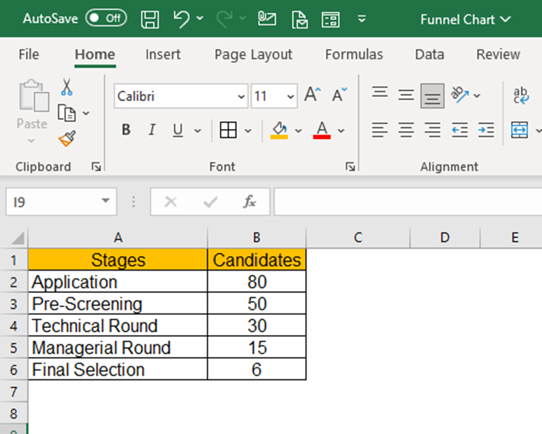
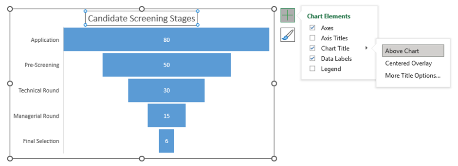
The example dataset taken is representing the application stages for a recruitment drive conducted by a company. The candidates column corresponds to the number of candidates qualified during each stage. The objective is to visualize the overall recruitment stages and selections.
Step 2: Select your data
Once the data is properly organized, we can select the data we want to include in our funnel chart. To do this, simply click and drag your mouse over the cells containing the data. If you have a large dataset, select your top leftmost cell then hold “shift” and select your most bottom right cell to select multiple ranges of data.
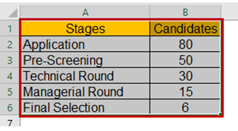
The selected dataset will be highlighted by a border across the text for visual confirmation.
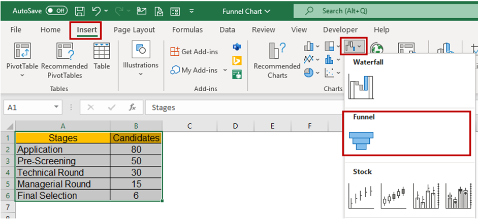
Step 3: Insert the Funnel chart
With our data selected, we can now insert a funnel chart into our spreadsheet. To do this, navigate to the "Insert" tab on the Excel ribbon and select "Funnel Chart" from the chart options.

Step 4: Add a chart title and legends
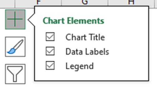
To make your funnel chart more informative, you can add a “title” and a “legend”. The title should clearly state what the chart represents, while the legend should provide information about the categories defined by the different segments of the graph. To add a title and legend, click on the chart to select it, then use the “Add Chart Element” followed by the “Chart Title” option in the "Chart Design" tab to add them. You can choose the Title layout from the sub-menu.
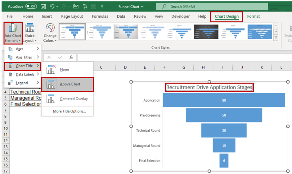
Another way to quickly access “Chart Elements” is to click on the + icon when you select the chart.
You can rename the Chart Title by clicking on the Title and editing the text directly. The “Format Chart Title” menu appears on the right side of Excel where you can change the background color of the Chart Title and set the Transparency options.
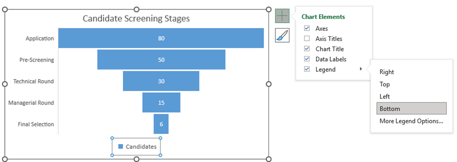
If you click on the Legends, then the “Format Legend” menu appears, which lets you define the position of legend appearance over the chart. You can also modify the text font, colors, and background color.
Step 5: Customize your Funnel chart
After you insert a funnel chart, you can customize it to suit your needs. As discussed previously, you can change the chart title, axis labels, and legend to provide context for your data. You can also adjust the color scheme and chart style to make your chart visually appealing and in doing so help you communicate your data more effectively to your audience.
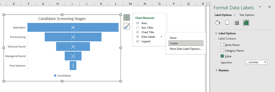
To customize the chart, select it and then use the options in the "Chart Design" and "Format" tabs in the ribbon. You can also use the "Chart Elements" quick access toolbar to enable data labels and choose a layout option.
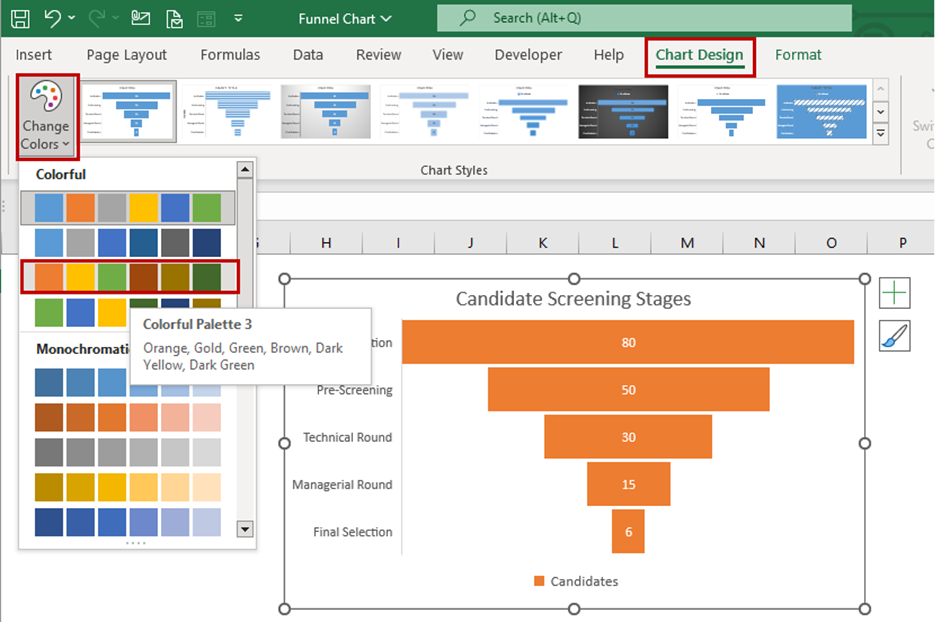
You can set the color scheme using the quick access “Chart Styles” and even choose a desired chart style.
The “Format Data Series” menu appears whenever the chart series is selected. From the dropdown list, you can choose the Chart Area, Title, Legend, Plot Area, and Series for customization.

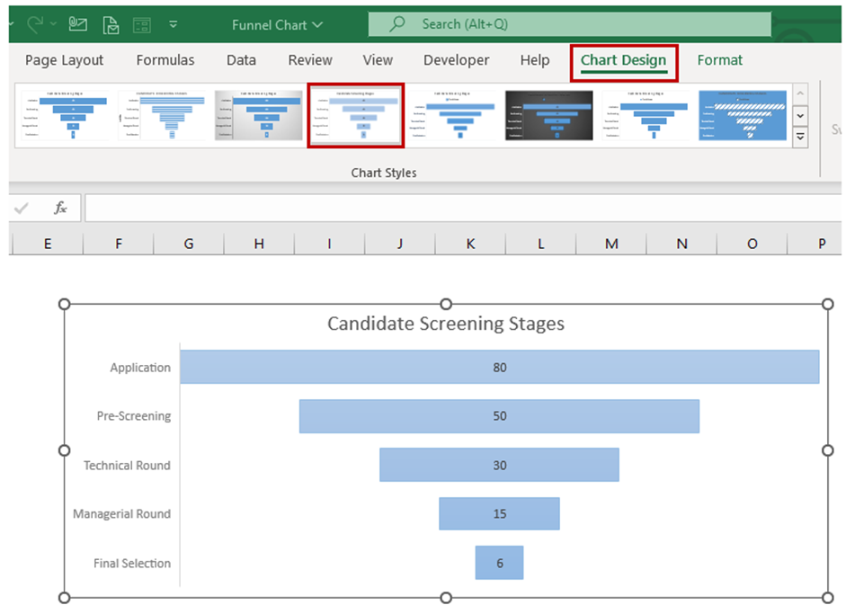
Selecting the Chart Styles
Excel offers a variety of chart styles that you can use to quickly and easily customize your charts. This is a great option if you need to give your charts a professional look without having to spend a lot of time customizing them manually.
To use the chart styles, click on the "Chart Design" tab and then click on the "Chart Styles" dropdown button. This will display a gallery of chart styles that you can apply to your chart. You can preview the different styles by hovering your mouse over them.

Step 6: Analyze your data
Once you have created your funnel chart, you can use it to analyze your data and gain insights. Look for trends and patterns in your data, and use your chart to illustrate these findings to your audience.
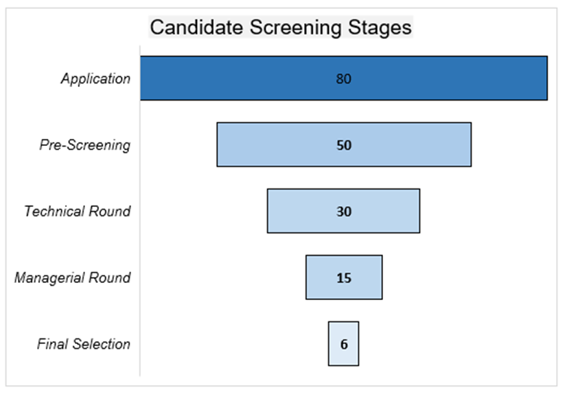
Looking at the plotted chart we could easily visualize the overall recruitment process screening rounds and how the candidates count gets filtered up with each successive stage. This also helps us give a visual insight that most of the applications get filtered out at the pre-screening level and further post-technical and managerial rounds.
Creating a funnel chart in Excel can be intimidating at first, but following these simple steps will help you create a visually appealing and informative chart in no time. So go ahead and impress your audience with your newfound Excel skills!
When should I create a Funnel chart in Excel?
Funnel charts are useful when you want to visualize a process that has multiple stages, with each stage representing a decrease in the number of items or individuals involved. They are often used in sales or marketing contexts to track the progress of leads or prospects as they move through a sales pipeline. Here are some situations where you might want to use a funnel chart in Excel:
- Sales pipeline: Use a funnel chart to track the progress of sales leads as they move through different stages, such as lead generation, qualification, and conversion.
- Website traffic: Use a funnel chart to visualize how website visitors move through different stages of the conversion funnel, such as landing page views, signups, and purchases.
- Recruitment process: Use a funnel chart to track the progress of job candidates as they move through different stages of the recruitment process, such as application, screening, and interview.
- Customer journey: Use a funnel chart to visualize the different stages of the customer journey, from awareness to consideration to purchase, and to identify areas where customers might be dropping off.
Overall, funnel charts are a useful tool for visualizing the stages of a process and identifying areas where improvements can be made. They can help you to see at a glance how many items or individuals are progressing through each stage, and where bottlenecks or drop-offs are occurring.
Additionally, funnel charts can be combined with other chart types, such as line charts or bar charts, to create more complex visualizations. For example, you might use a Funnel chart to show the conversion rates between stages of a process, and a line chart to show how those conversion rates have changed over time. Overall, Funnel charts are a useful tool for visualizing the flow of items through a process, but it's important to use them appropriately and interpret them correctly to avoid misleading conclusions.
Funnel charts are not suitable for all types of data; they are specifically designed to display data where there is a decreasing trend in the number of items as you move down the stages of a process. If your data doesn't follow this pattern, a different chart type might be more suitable. It's important to use good judgment and data visualization best practices when creating and interpreting Funnel charts.
A note on the components of a Funnel chart in Excel
Some important factors to consider when creating a funnel chart in Excel include:
- Stage labels: Each stage of the funnel should be clearly labeled to indicate what it represents, such as "leads" or "sales". These labels can be placed above or below the funnel shape.
- Value axis: The value axis on a funnel chart represents the number or percentage of items or individuals at each stage of the process. The values should be clearly labeled to indicate the scale of the axis.
- Funnel shape: The funnel shape itself is an important parameter of the chart. The width of the funnel at each stage should be proportional to the number or percentage of items or individuals at that stage.
- Color coding: Using different colors to differentiate each stage of the funnel can make it easier to read and understand the chart. For example, using green for the first stage and red for the last stage can make it clear which stages are more successful than others.
- Data labels: Including data labels on the chart can help to show the exact values for each stage of the funnel. This can be useful when presenting the chart to others or when comparing different funnel charts.
Overall, the components of a funnel chart should be carefully chosen to ensure that the chart accurately represents the process being visualized and is easy to read and understand.

