How to Create a Stacked Bar Chart in Excel
In this article, you will learn about the Stacked Bar Chart and how to create it in Excel.
What is a Stacked Bar chart in Excel?
A stacked bar chart is a visual representation of data that allows you to present multiple series of information in horizontal bars that are stacked on top of one another. Each bar in the chart represents a specific category or data point, and the height of each segment within the bar corresponds to the value or proportion of that category within the dataset.
By stacking the bars, it becomes effortless to grasp the total value associated with each category and gain insights into the contributions of individual categories to the overall total. This visualization aids in comprehending the relative sizes and composition of different categories, facilitating the identification of trends, patterns, and comparisons between them.
How to make a Stacked Bar chart in Excel
In this article, we will guide you through the steps to create a stacked bar chart in Excel.
Step 1: Organize your data
Before we begin creating our stacked bar chart, we need to ensure our data is organized properly. This means arranging our data in a tabular format, where each column represents a distinct category or data point.
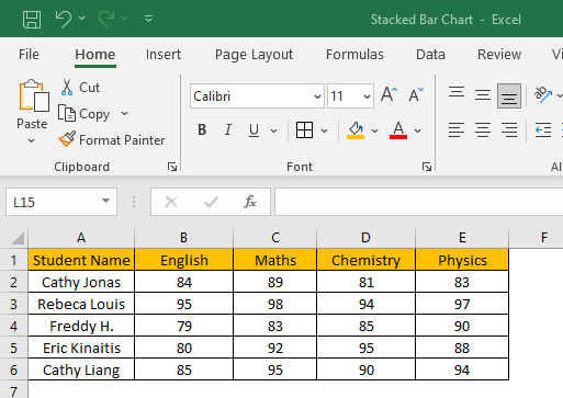
The example dataset taken is for high school students' grades obtained in various subjects. The objective is to visualize the grades obtained by each student for various subjects and identify the data trends. In terms of data preparation, you need to ensure a clean, formatted, and consistent dataset.
Step 2: Select your data
After ensuring the data is properly organized, we can select the data we want to incorporate into our Stacked Bar chart. To do this, simply click and drag your mouse over the cells containing the data. If you have a large dataset, you can hold down the "Ctrl" key (or “Cmd” on Mac) and select multiple data ranges.
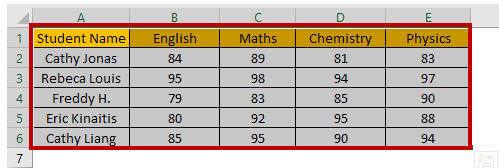
The dataset chosen will be highlighted by a border across the text for visual confirmation.
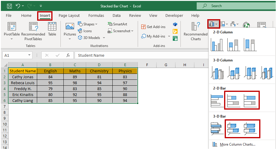
Step 3: Insert the Stacked Bar chart
With our data selected, we can now insert a Stacked Bar chart into our spreadsheet. To do this, navigate to the "Insert" tab in Excel and select "Stacked Bar Chart" from the chart options. You can choose from various stacked bar chart types, such as 3D stacked Bar charts or 100% stacked Bar charts.
Step 4: Add a chart title and legends
To make your stacked bar chart more informative, you can add a “title” and a “legend”. The title should clearly state the chart subject, whereas the legend should provide details about the categories defined by the various portions of the graph. To add a title and legend, navigate to the “Chart design” tab and click on the chart to select it, then click use the “Add Chart Element” followed by the “Chart Title” option. You can choose the Title layout from the sub-menu.
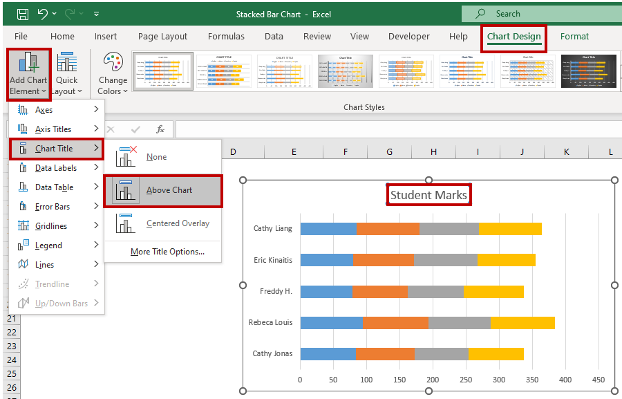
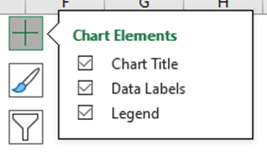
Another way to quickly access “Chart Elements” is to click on the + icon at the top right corner when you have selected the chart.
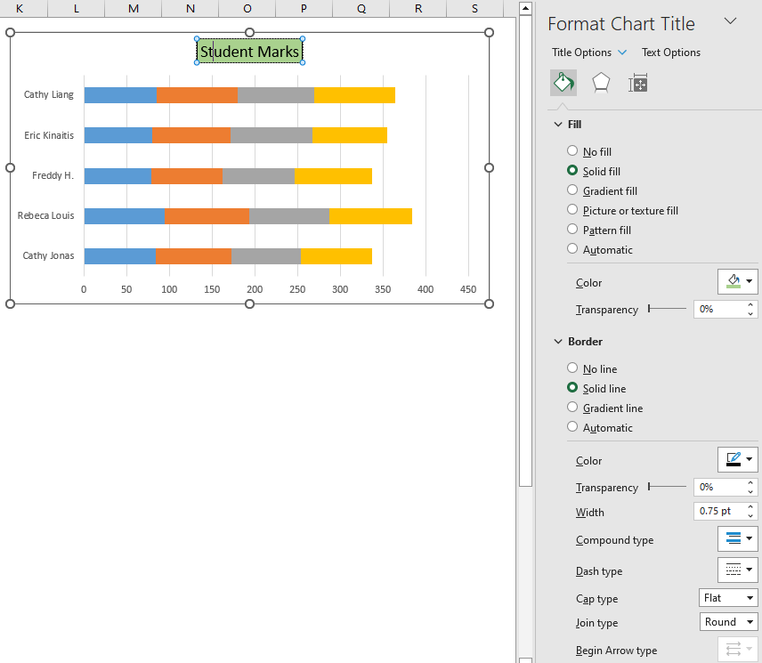
You can rename the Chart Title by clicking on the Title and editing the text directly. The “Format Chart Title” menu appears on the right side of Excel, where you can change the chart title's background color, borders, and other customizations.
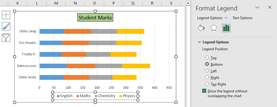
If you click on the Legends, then the “Format Legend” menu appears, which lets you define the position of legend appearance over the chart. You can also modify the text font, colors, background color, and more.
Step 5: Customize your Bar chart
After inserting a Stacked Bar chart, you can customize it by changing the chart’s title, axis labels, and legend. You can also adjust the color scheme and chart style to make it visually appealing. These customizations can help you provide context for your data and make your chart easier to understand.
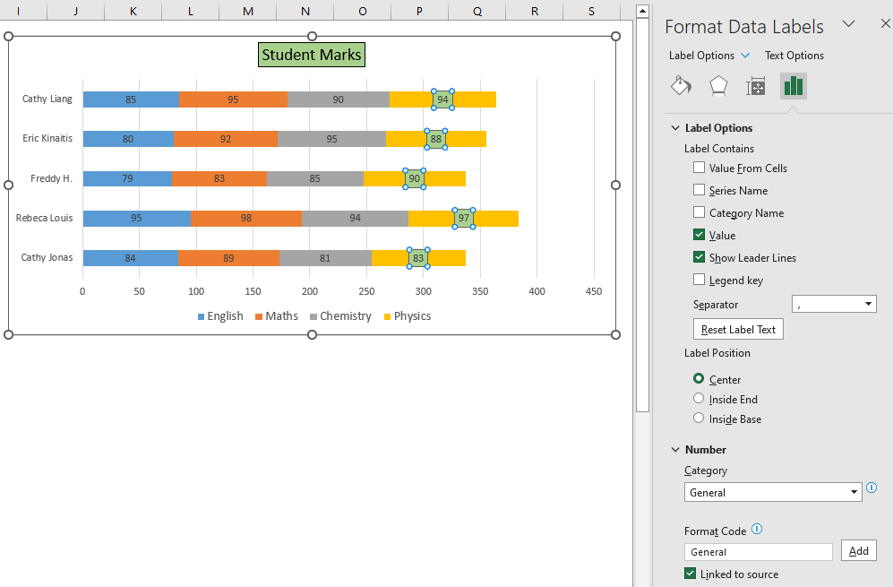
To customize the chart, click it to select it, then use the options in the "Chart Design" and "Format" tabs. Using the quick access “Chart Elements”, you can enable the “Data Labels” and choose the layout option.
You can set the color scheme using the quick access “Chart Styles” and even choose a desired chart style.
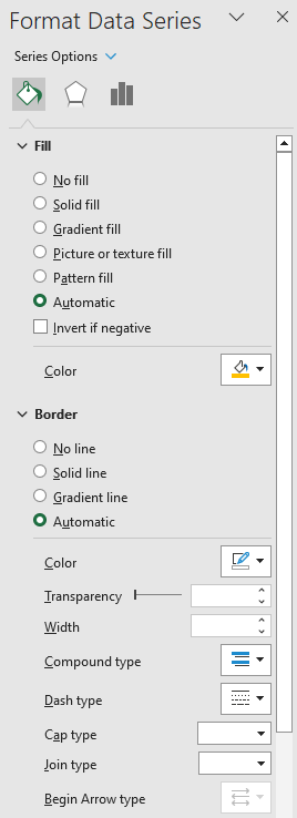
The “Format Data Series” menu appears whenever the chart series is selected. From the dropdown list, you can choose the Chart Area, Title, Legend, Plot Area, and Series for customization.
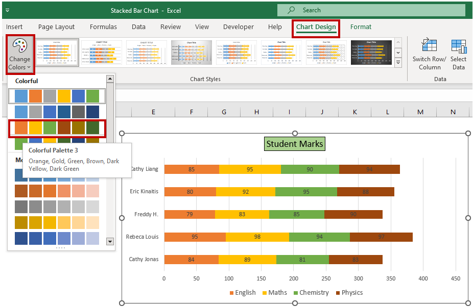
Selecting the Chart Styles
Excel provides various chart styles that you can use to quickly and easily customize your charts. These styles can give your charts a professional look and feel, without requiring you to know how to use all of the customization options available in Excel.
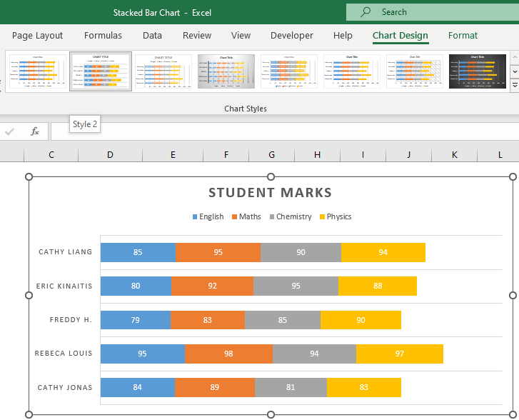
To do this you need to click the “Chart Design” menu and then the dropdown button to expand the chart styles in the “Chart Style” group. To preview a style, hover your mouse over it. When you find a style you like, click it to apply it to your chart.

Step 6: Analyze your data
Now that you have created your bar chart, you can analyze your data to gain understanding and draw conclusions. Use your chart to illustrate the trends and patterns in your data to your audience.
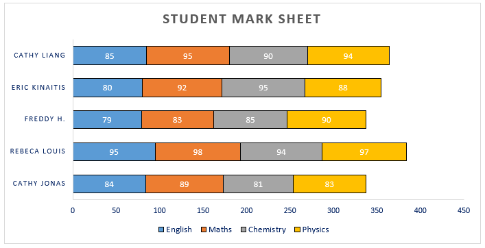
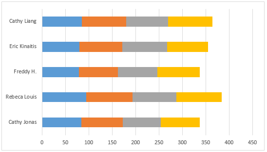
Looking at the plotted chart, we could quickly visualize the students' performance in various subjects and determine the high scorers in respective subjects. We can also compare the grades between two or more students by comparing the length of the bars.
At first glance, creating a Stacked Bar chart in Excel may appear daunting, but by following these straightforward steps, you can create a visually appealing and insightful chart with ease. So go ahead and impress your audience with your newfound Excel skills!
When should you make a Stacked Bar chart in Excel?
Some circumstances where one should consider making a stacked bar chart in Excel includes the following:
- Comparing composition: When you want to compare the composition or distribution of different categories within a dataset. Stacked bar charts allow you to visualize how each category contributes to the total and easily identify the relative proportions.
- Total size comparison: If you need to compare the total sizes of multiple categories. Stacked bar charts make it easy to see which categories have larger or smaller values and understand the overall magnitude of each category.
- Tracking changes over time: When you want to track changes or trends over time for multiple categories. Stacked bar charts enable you to observe how the composition and proportions of categories shift from one time period to another.
- Highlighting part-to-whole relationships: If you want to emphasize the relationship between individual components and the whole. Stacked bar charts showcase both the individual segments and the combined total, helping you understand the relative significance of each category.
- Presenting categorical data: When you have categorical data that needs to be visualized. Stacked bar charts provide an intuitive and visually appealing way to represent and communicate categorical information.
Overall, stacked bar charts are useful for displaying and comparing data with multiple categories, especially when you want to examine composition, proportions, changes over time, and part-to-whole relationships. They are particularly effective when you need to quickly grasp and communicate the relative sizes and contributions of different categories within a dataset.
A word of advice on the Stacked Bar chart in Excel
Something to keep in mind when working with stacked bar charts in Excel is that they are most effective when the total values of each category are comparable. If the total values vary significantly between categories, it can distort the visual representation and make it challenging to interpret the chart accurately.
Additionally, be cautious when using stacked bar charts to compare individual values within a category. The stacked format makes it difficult to precisely assess the magnitude of each segment. In such cases, it might be more appropriate to use other chart types, such as a clustered column chart or a line chart.
Lastly, ensure that your stacked bar chart has a clear and informative axis label, a descriptive title, and appropriate data labels or legends to help viewers understand the chart's content and context.
Remember, the suitability of a stacked bar chart depends on the specific dataset and the insights you want to convey. Always consider alternative chart types and choose the one that best represents your data accurately and facilitates clear understanding for your audience.
Notes on Stacked Bar Charts
Here are a few more things one may find useful to know about stacked bar charts:
Limitation with too many categories: Stacked bar charts can become visually cluttered and challenging to interpret when there are too many categories or when the labels for the categories are lengthy. In such cases, it might be better to consider alternative chart types or grouping similar categories together.
Consider data order: The order in which the categories are stacked can impact the perception of the chart. It's essential to consider the logical or meaningful order for the categories to ensure that the chart effectively communicates the intended message.
Comparison challenges with varying totals: When the total values for each category significantly differ, it can make it difficult to compare the proportions accurately. In such cases, it might be helpful to normalize the data by using percentages or ratios instead of absolute values.
Stacked 100% bar chart: Excel offers a variant of the stacked bar chart called the "Stacked 100% Bar" chart. This chart type represents each category as a percentage of the total, allowing for a direct comparison of relative proportions. It can be useful when you want to focus on the composition and relative contributions of the categories.
Combination with other chart types: Stacked bar charts can be combined with other chart types, such as line charts or clustered bar charts, to present additional dimensions of data. This combination can provide a more comprehensive view and facilitate deeper insights.
Labeling challenges: Labeling individual segments within a stacked bar chart can be challenging, especially when the segments are small or have similar values. In Excel, you can add data labels to the chart to display the values or percentages for each segment, but keep in mind that excessive labeling can clutter the chart.
Understanding these additional aspects can help you make informed decisions when working with stacked bar charts and ensure that you use them effectively to present and analyze data.

