How to Insert SmartArt in Excel (Simple Manual with Example)
One way to make your data on Excel more visually appealing is by using SmartArt graphics. In this guide, we'll explore the benefits of adding SmartArt graphs to your Excel spreadsheets and show you how to easily insert them.
Benefits of adding SmartArt graphs in Excel
SmartArt is a powerful tool in Excel that can significantly enhance the visual appeal and effectiveness of your Excel spreadsheets. While there are numerous benefits of using SmartArt charts, the most crucial ones are outlined below.
- Visual Appeal: SmartArt graphics in Excel can make your data more visually appealing and engaging for your audience. They can help you to present your information in a more organized and structured manner.
- Efficient Communication: SmartArt graphics can help you to communicate complex ideas and data quickly and efficiently. They can help to simplify information and make it easier for your audience to understand your Excel worksheet.
How to insert SmartArt in Excel?
Here are the steps to easily insert SmartArt in Excel:
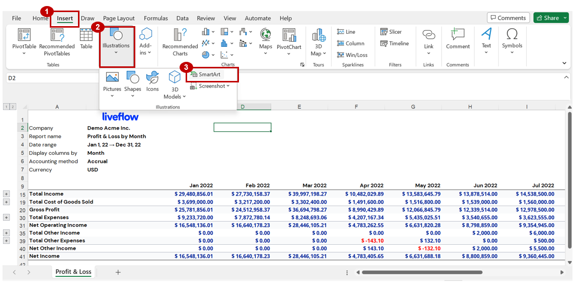
Step 1: Select the cell or area in Excel where you wish to insert the SmartArt.
Step 2: Click on the ‘Insert’ option in the Excel Toolbar.
Step 3: Click on the ‘Illustrations’ section and then select the ‘SmartArt’ option.
Step 4: Choose a SmartArt Graphic
A window will pop up with various categories of SmartArt graphics to choose from. Select the category that best suits your needs and click on the specific SmartArt graphic you want to use in your Excel sheet.

Step 5: Customize your SmartArt Graphic
Once you have selected your SmartArt graphic in Excel, you can customize it by adding text, changing colors, and resizing it to fit your needs.
- To add text, simply click on the SmartArt graphic in the Excel sheet and start typing your content. You can also copy and paste text from another source by selecting the text, pressing the “Ctrl” (“Command” in case of Mac) and “C” keys to copy, and then pressing the “Ctrl” (“Command” in case of Mac) and “V” keys to paste it into the SmartArt graphic.
- To change colors, click on the SmartArt graphic and then click on the ‘Change Colors’ button in the ‘SmartArt Tools’ tab on the Excel toolbar.
- To resize the SmartArt graphic, click and drag the corners of the graphic to make it larger or smaller.
That's it! By following these simple steps, you can easily insert SmartArt graphics into your Excel workbooks and enhance your data presentation.
Example: Using SmartArt in Excel to present financial highlights
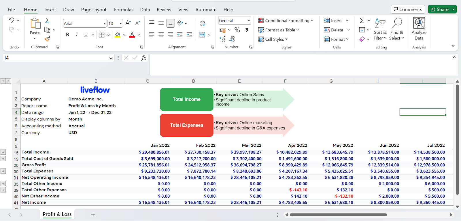
If you're looking to showcase financial highlights to stakeholders and provide them with a quick overview, consider using SmartArt graphics in Excel. Take a look at the image below for an example of using SmartArt to present financial highlights in your Profit and Loss statement. As illustrated in the image, it can help viewers quickly gather the key information you wish to share about your Profit and Loss statement.


